Writing on graphic design has a history of avoiding discussion of form. ‘We know no formal problems … Form is not the goal but the result of our work’, wrote the architect Mies van der Rohe in 1923. Yet nonetheless, for graphic designers contemporaneous to Mies, primary colours along with circles, triangles and squares seemed to inevitably ‘follow function’. From our historical vantage point we can recognise work from this period immediately on formal grounds, without needing to discover what particular ‘function’ was supposedly addressed by circles, triangles and squares.
Along with ‘problem solving’ and ‘function’, today social politics threatens to again push discussion of form to the margins of graphic design discourse. Discussion of the social impact of design and issues to do with inclusivity and representation are of course of importance in the design industry. This deserves attention, as it does in all areas of life. But in the meantime, what is particular to design — form — remains under analysed.
Designers everyday make decisions on form, based on a nuanced, unverbalised understanding of formal trends and their current (and ever changing) connotations. We know how it feels to watch a once perfect typeface (Stag, Gotham, Graphik) drift from sophistication to cliché through repeated use. So we choose something else, something with different nuances of form. We also know how it feels to see a once unusably kitsch typeface (Hobo, Benguiat, Quorum) be recontextualised by a clever young designer who can manipulate and change its formal connotations. The task is judicious deployment of appropriate form.
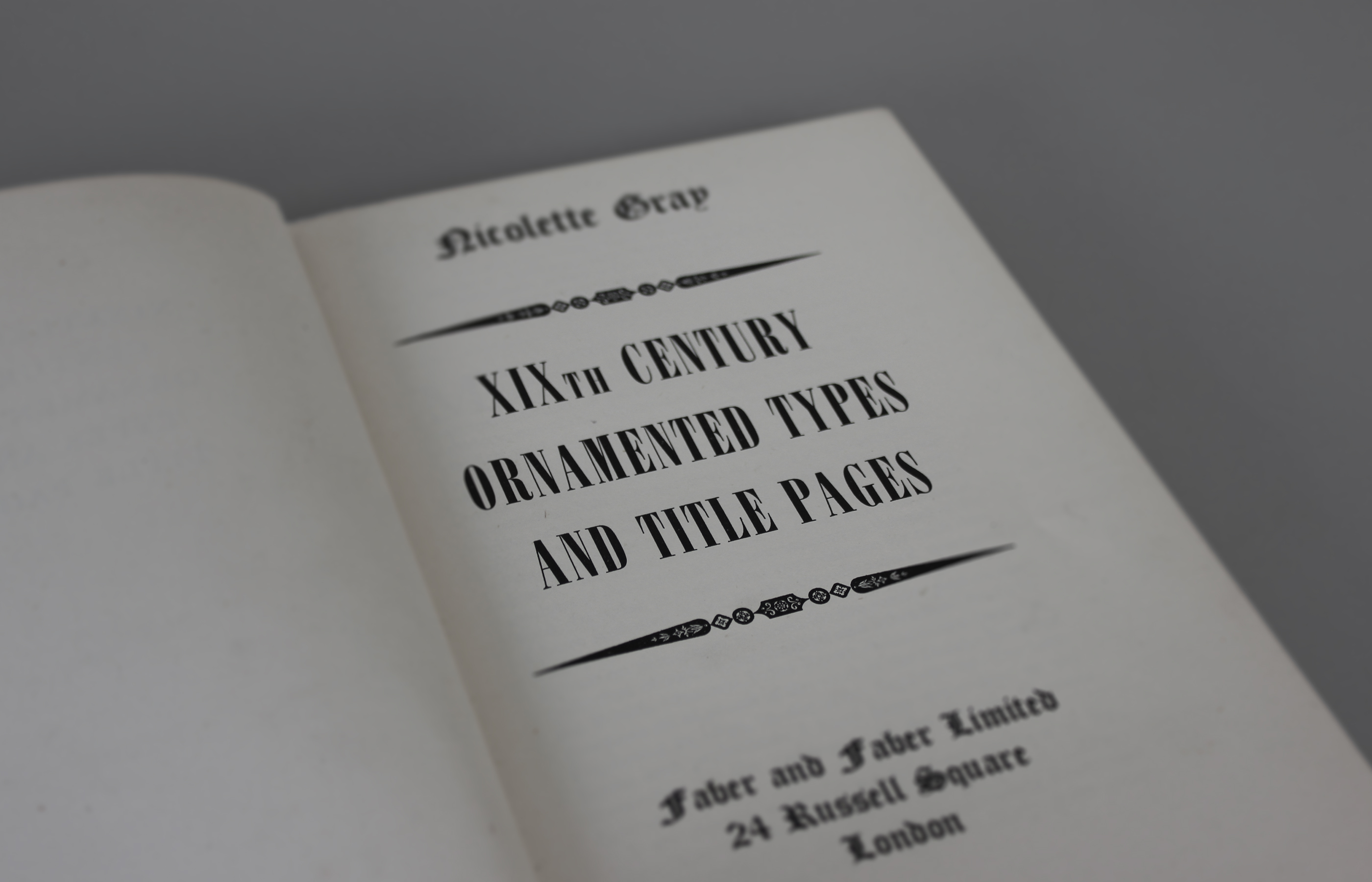
There are models we can turn to for help here. In the 1938 — two years after Nikolaus Pevsner famously denounced form in favour of problem-solving modernism — Nicolete Gray published a book entitled, Nineteenth Century Ornamented Types and Title Pages. As her peers were busy chastising the supposed formal excesses of nineteenth-century design, Gray described the nineteenth century’s typographic formal abundance as follows:
'Suddenly, without warning, the insular English craftsman began to use a complicated and sophisticated artistic medium in a way totally foreign to his culture, and used it with verve and subtlety. It is a remarkable phenomenon … The changing moods which are recorded in Victorian typedesigns are not those of the individual artist, but a reflection of the mood of his society.'
Gray’s point is that it was precisely the everchanging nature of typographic form in the nineteenth century that allowed it to communicate with its public (the form being directed by a reciprocal relationship between producer and consumer). The formal explosion in typeface design that began in the nineteenth century continues today, albeit more often at a nuanced level of difference. That leaves us today with a rich history of typographic forms whose connotations we can exploit and manipulate through recontextualisation. When discussing graphic design, continuing to downplay form is avoiding the issue.