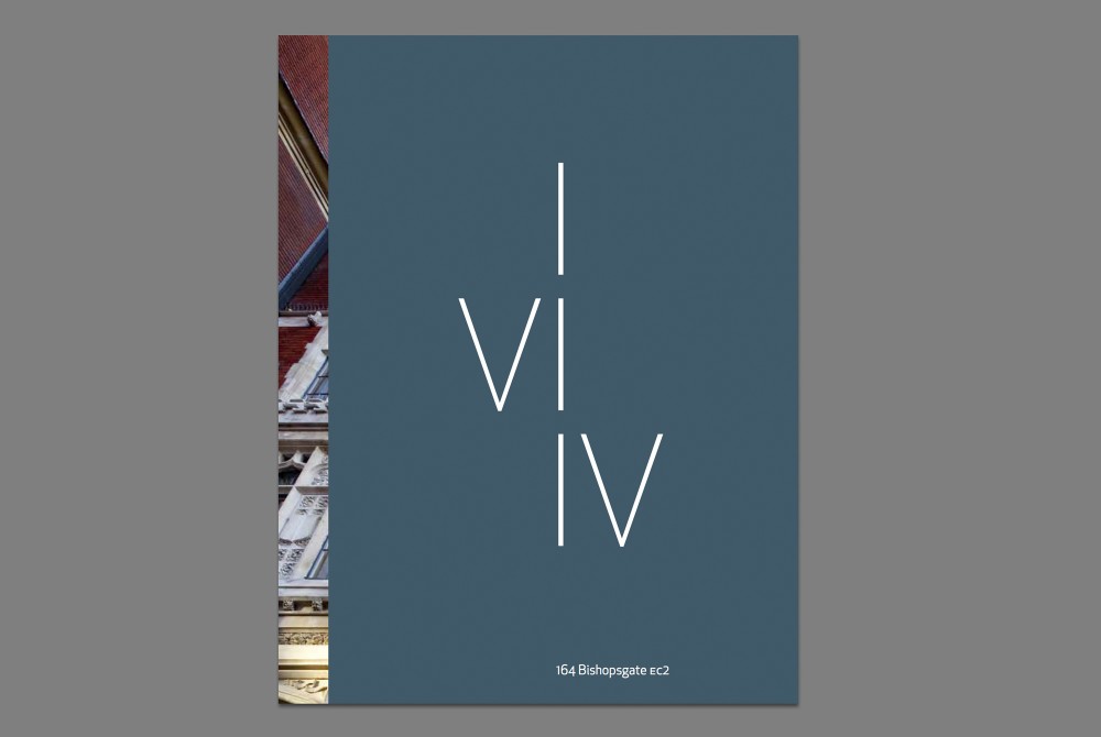
164 Bishopsgate (2012)
Designed by Ross Harrington at dn&co.
Strategy and Direction: Ben Dale & Joy Nazzari
Industry: Commercial
Tags: Architecture
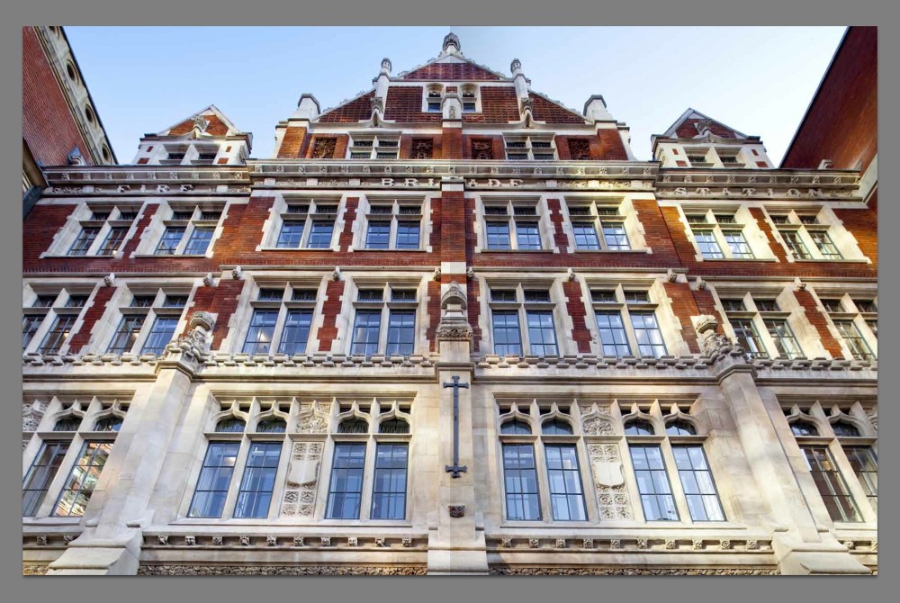
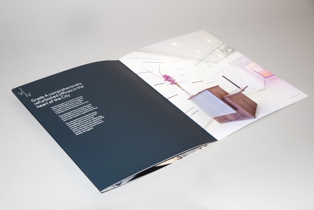
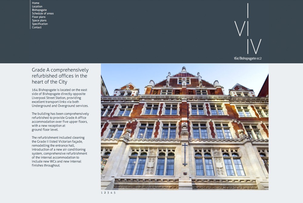
164 Bishopsgate is an office refurbishment in a Grade II listed Victorian fire station in the City of London. dn&co were asked to create a visual identity and marketing materials which would reflect the modern interior and somehow reference the historical aspect of the building.
We began looking at ways to express these qualities typographically. By setting 164 in Roman numerals and stacking them, a vertical axis is formed which references the symmetry of the historical façade, while the thin, sans-serif typography represents the new development of the five floors inside the building.
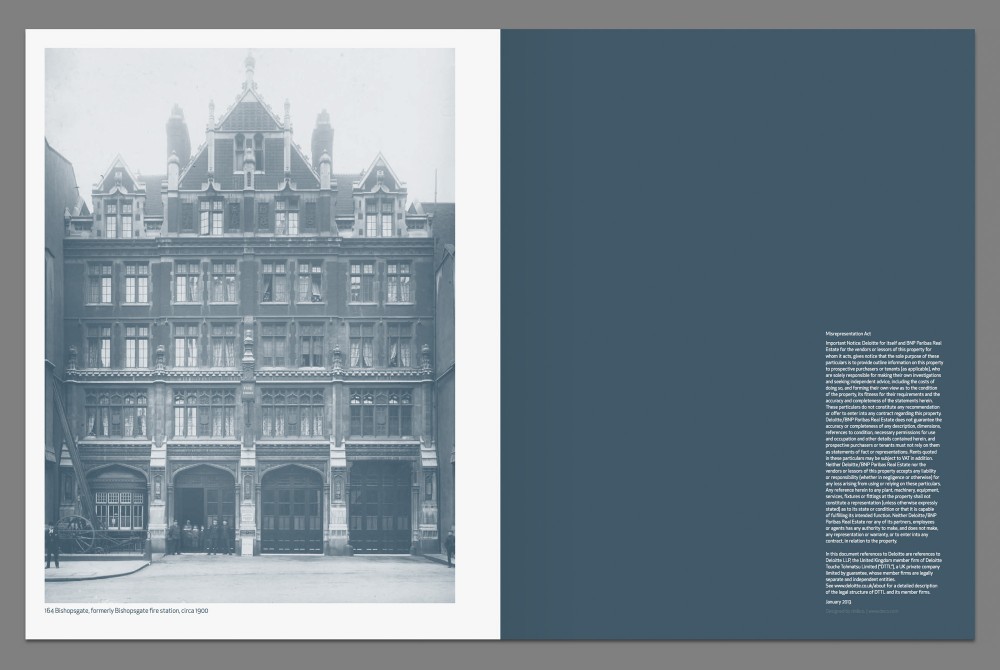
The brochure cover features a fold which can be opened to reveal a large image of the newly-restored façade. In researching the history of the building, we came across an interesting photograph of the building from around 1900, in the London Fire Brigade archive. Fortunately we were able to use the image and included it on the last page of the brochure. If you look closely you can see people looking out of the upstairs windows – it must have been quite a novelty to have a building photographed at that time.
Other materials included signage, a website, golf umbrellas and on-site advertising.