A’DAM Toren: Building Wrap (2014)
Designed by Garech Stone and Declan Stone at The Stone Twins
Banner Print + Installation: M2 Printing
Photography: Marc Driessen
Categories: Identity
Industry: Commercial
Tags: Music
Website: adamtoren.nl
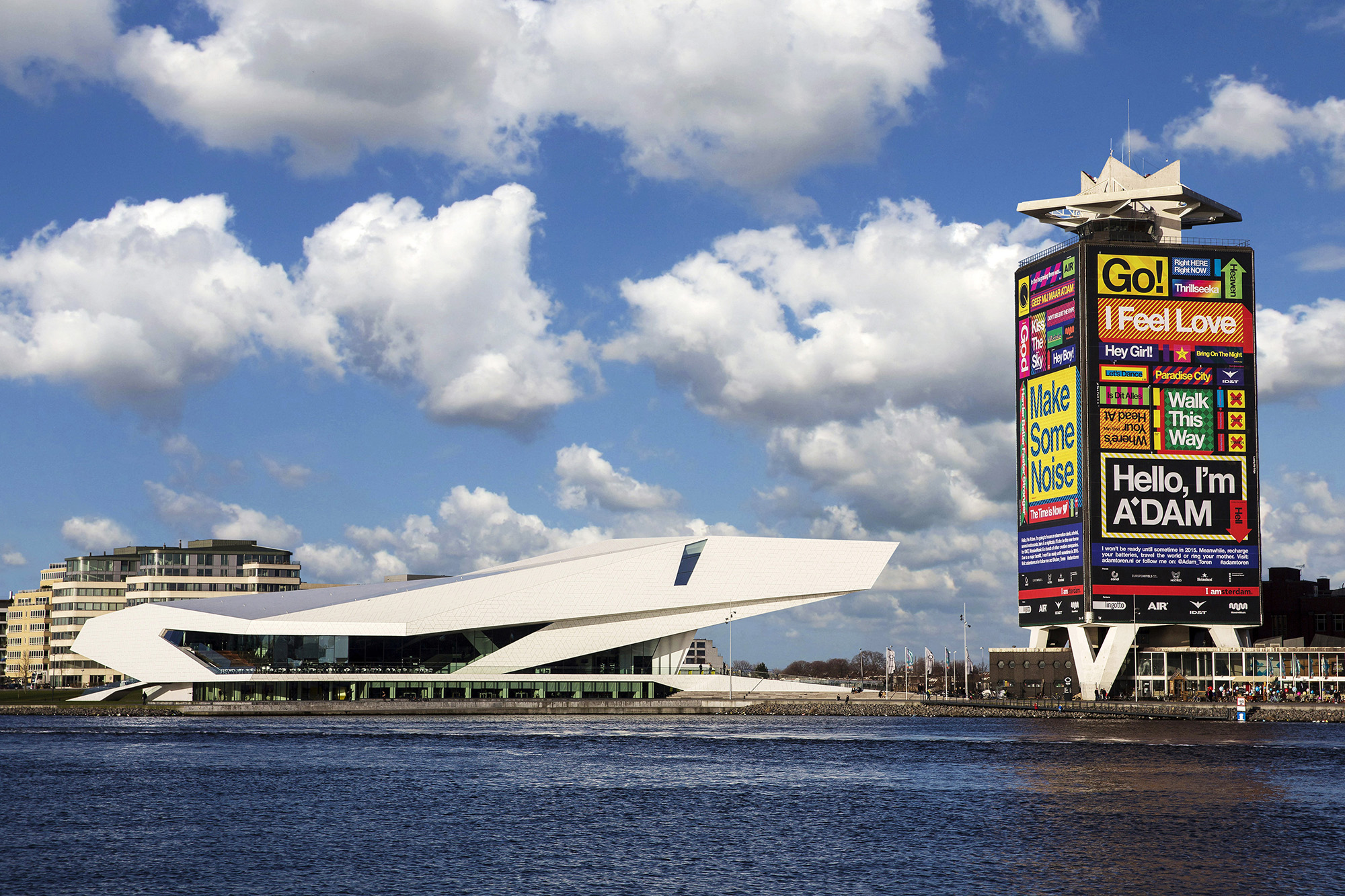
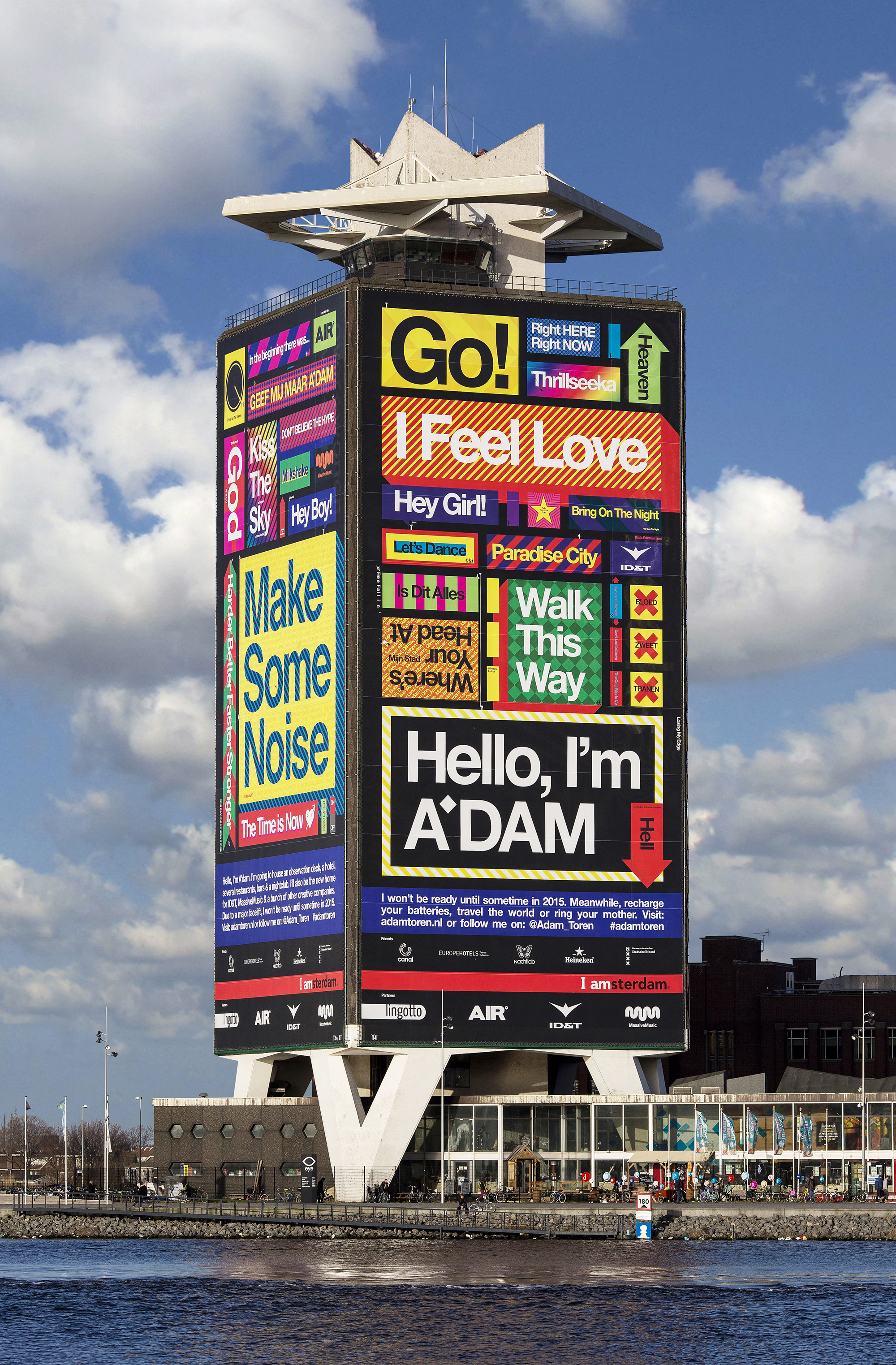
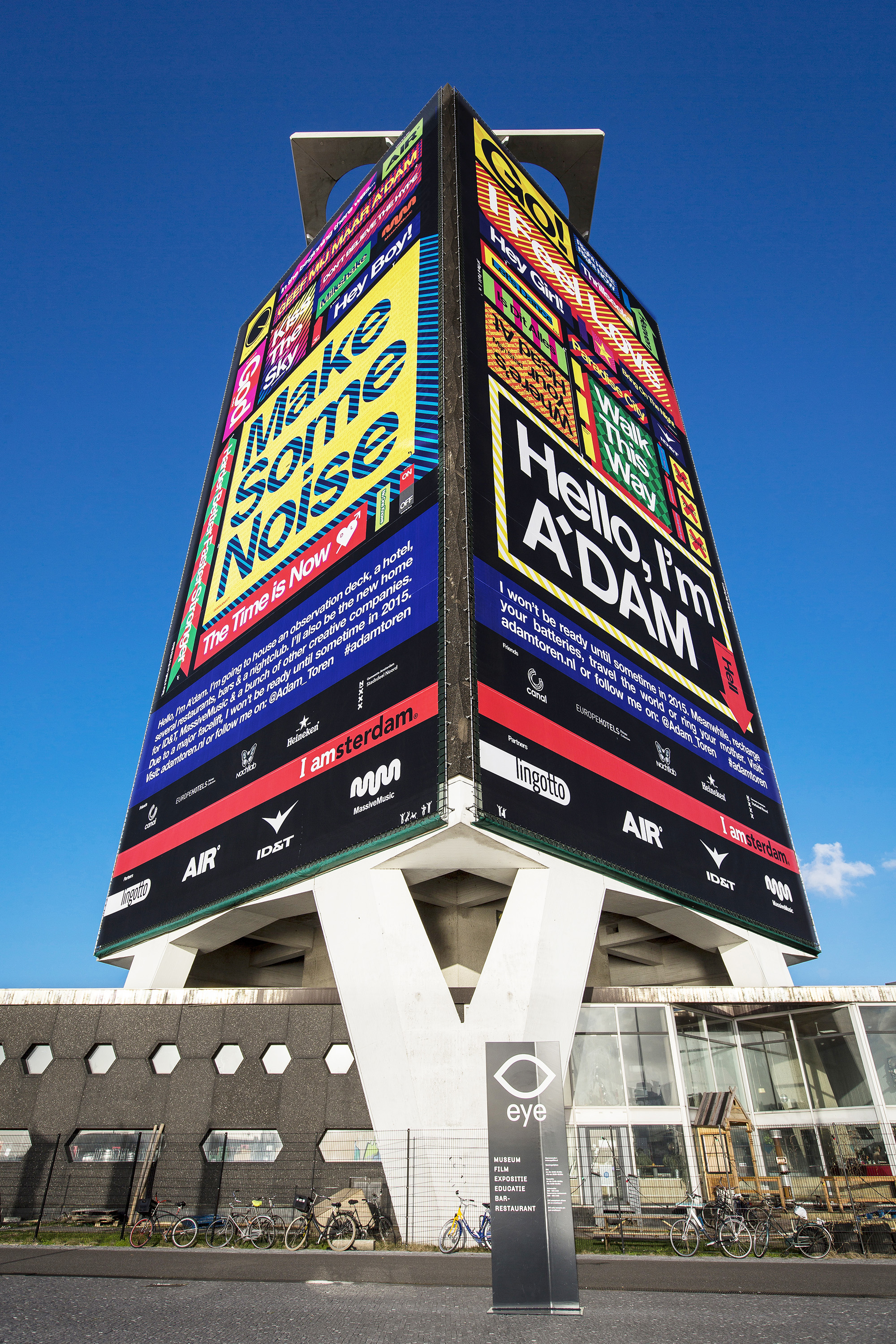
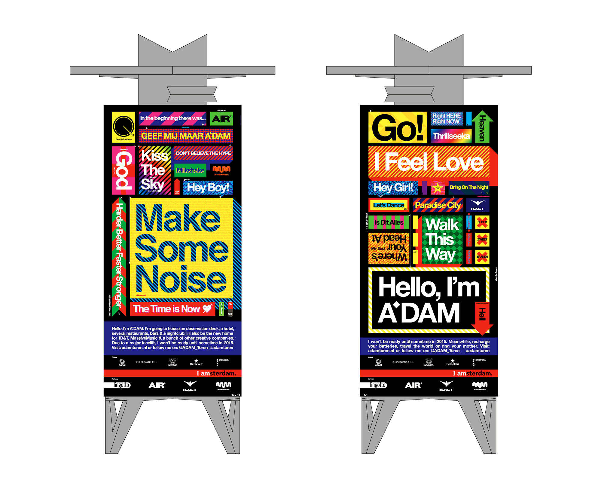
As part of the launch campaign for A’DAM Toren (the former Headquarters of Royal Dutch Shell), two gigantic banners adorn its façade. Each measures 52 x 25 meters, and are the biggest in the Netherlands. The unashamedly bold design features an eclectic array of song titles and is based on the architectural grid of the tower. The vivid colours and arresting typography convey the energy behind the exciting redevelopment plans. The positive messaging references many iconic dance-tracks such as ‘Go’, ‘I Feel Love’, ‘Hey Boy, Hey Girl’, ‘Harder, Better, Faster, Stronger’, amongst others. Importantly, the music theme reflects the heritage and core-business of the developers/anchor tenants: ID&T, AIR and MassiveMusic.
The new brand name A’DAM (also devised by The Stone Twins) is a cheeky reference to the well-known abbreviation of Amsterdam, as well as an acronym for ‘Amsterdam Dance and Music’. From June 2014, the landmark tower will be redeveloped into a mix of offices, entertainment venues, a hotel and an observation point with a revolving restaurant. It is due to open in late 2015.