Featherblade
Designed by Seán Mongey, Robert Farrelly and Andrew McNamee at Post Studio
Categories: Identity
Industry: Commercial
Website: featherblade.ie
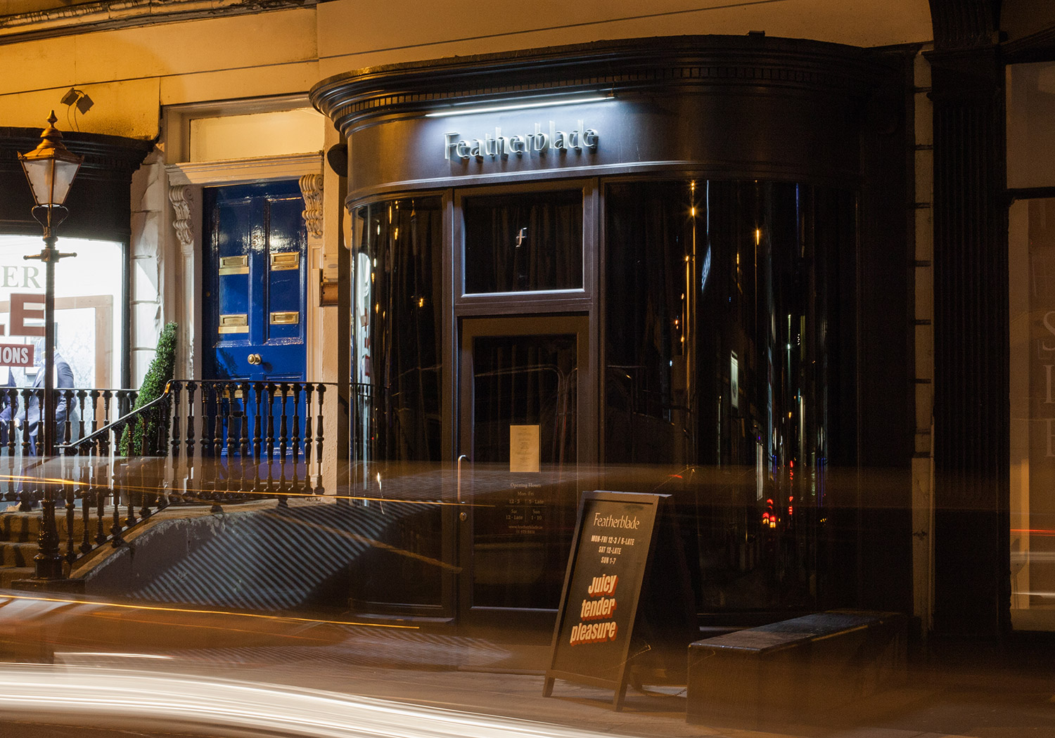
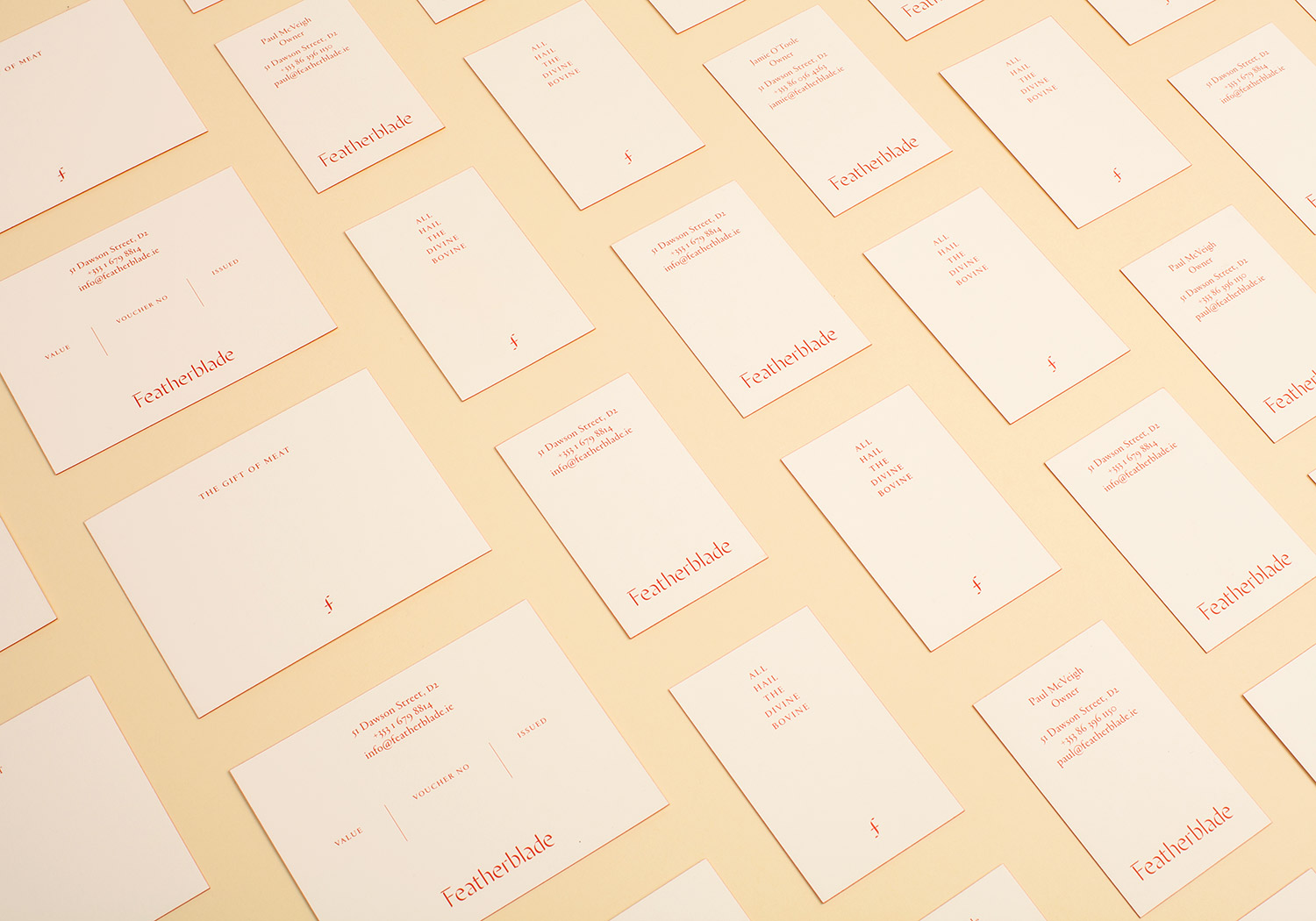
We we’re approached by Jamie O’Toole and Paul McVeigh to develop and identity for a steak restaurant they were opening on Dawson Street. The premise was simple, make often overlooked cuts of meat amazing through different cooking processes suited to each piece of meat. One of these cuts (a Feather Blade) was the main cut to be served which would be complemented by a selection of interesting and delicious sides and cocktails.
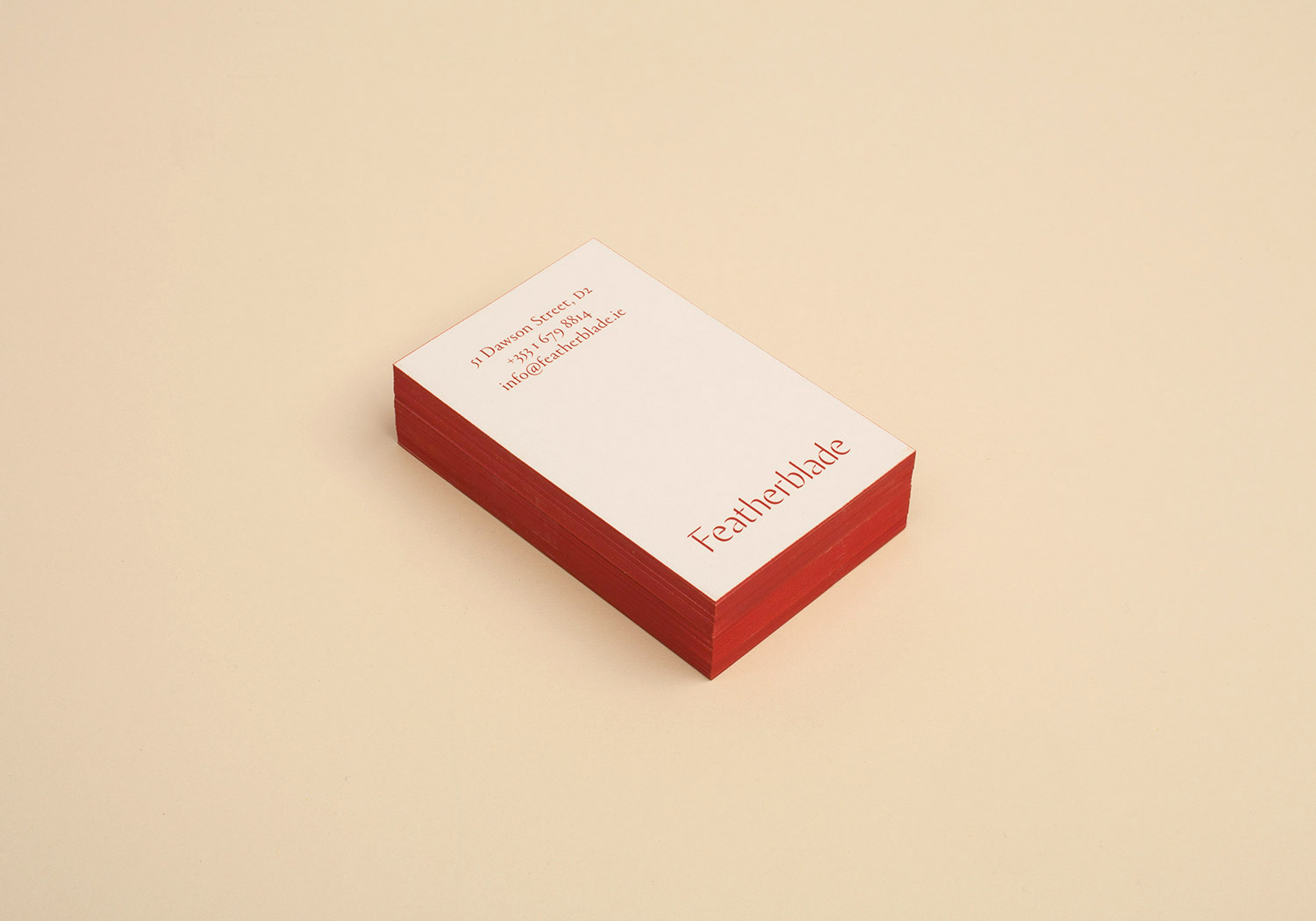
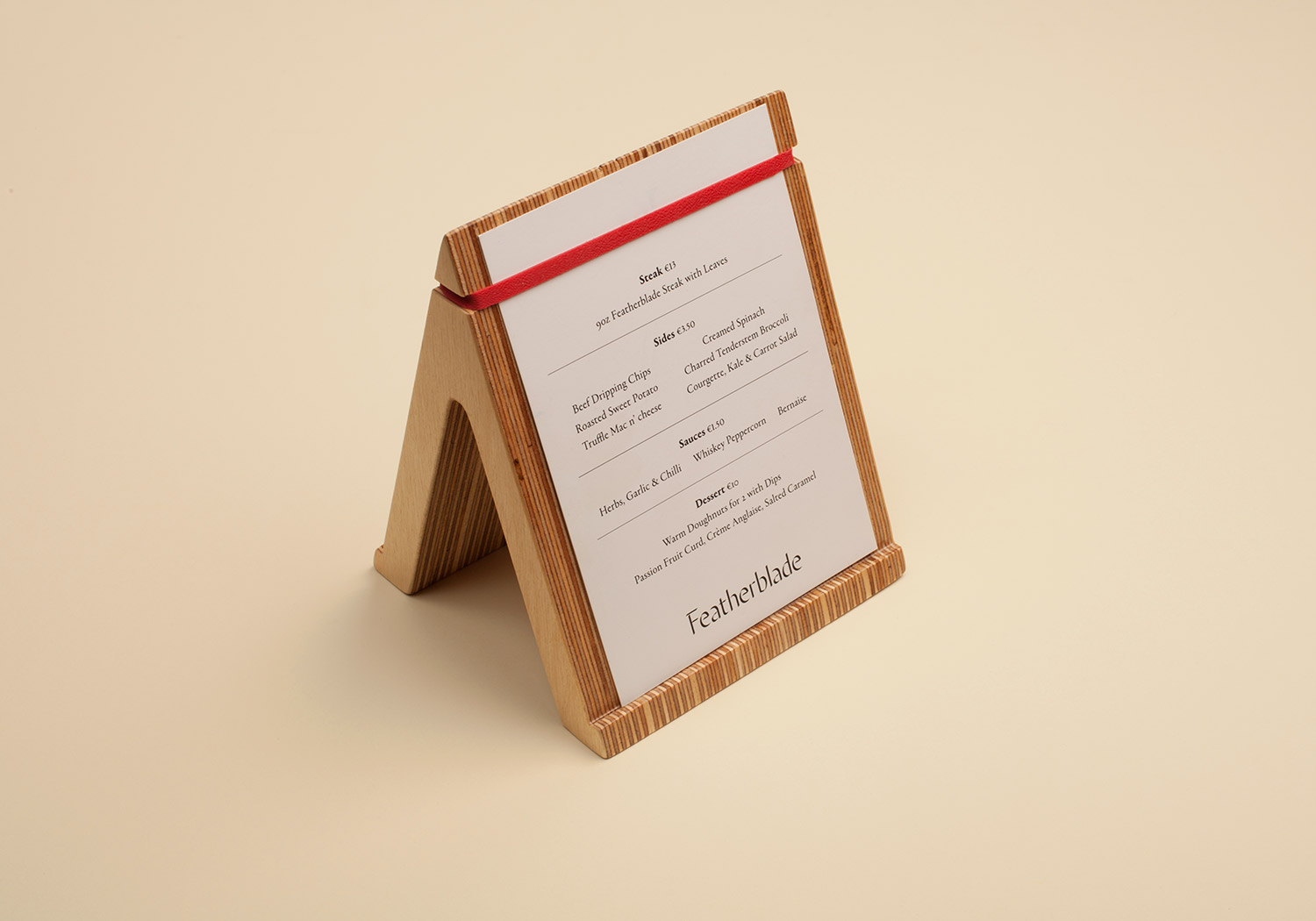
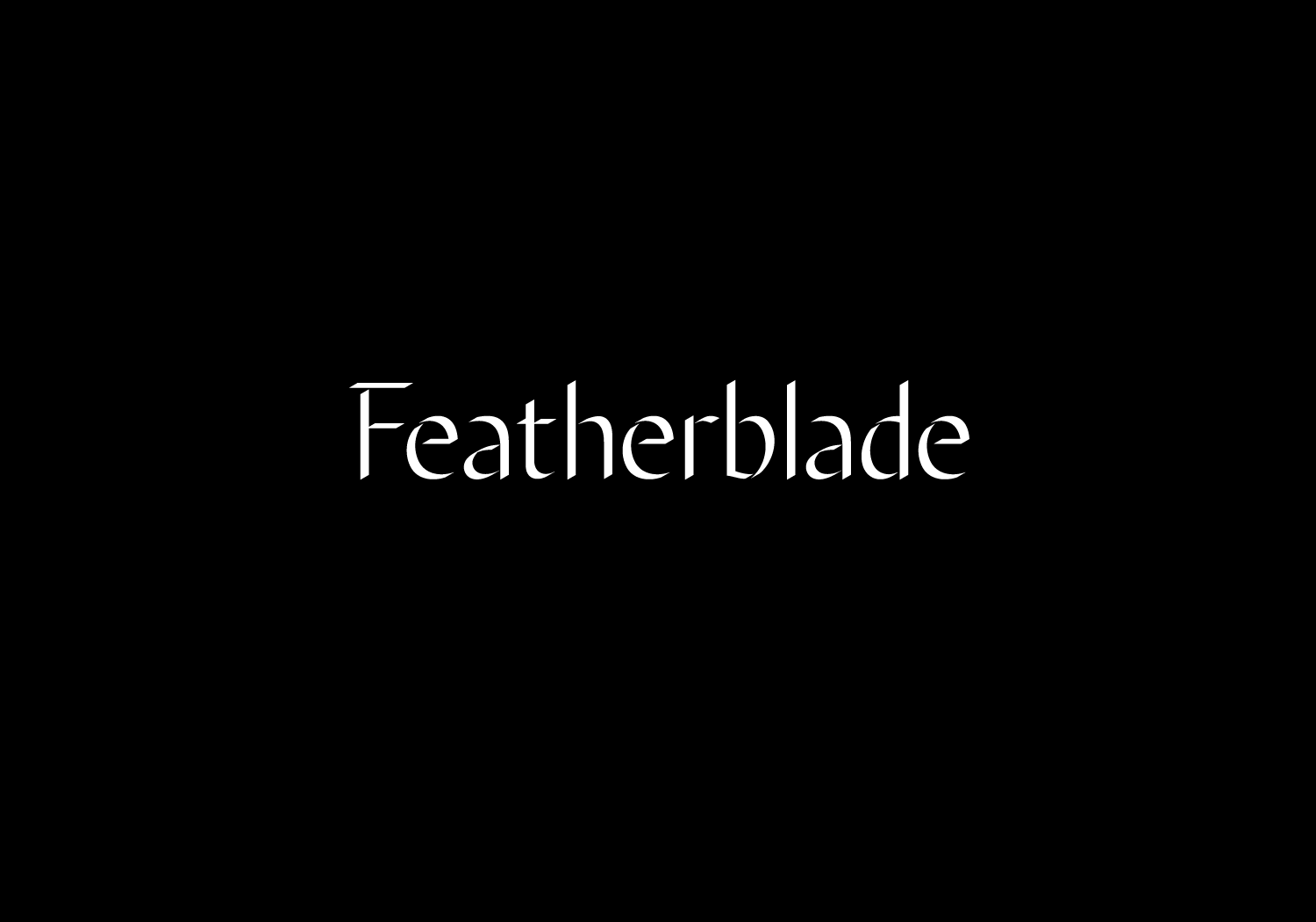
We took the name quite literally and decided to create letterforms that could be made out of thin sheet metal. These would then form the basis of the typographic mark. By constructing paper demos we found the cast light gave the 3 dimensional forms a calligraphic feel which translated nicely to physical application. In turn we made a display typefaces from the shadowed version which is used for print applications. Overall we used a simple colour palette of black, white and red; bringing out the red in small details like rubber bands for the table menus we designed; as well as edge colouring the different cards they needed.