FF Spinoza (2011)
Designed by Max Phillips at Signal Type Foundry
Categories: Typeface
Industry: Commercial
Website: signalfoundry.com/spinoza.html
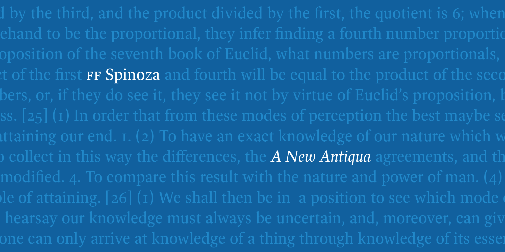
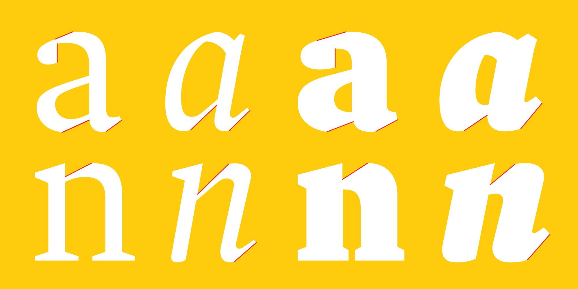
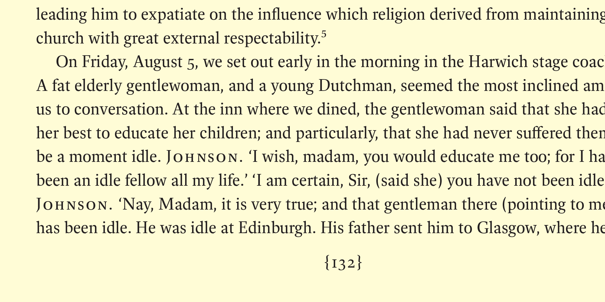
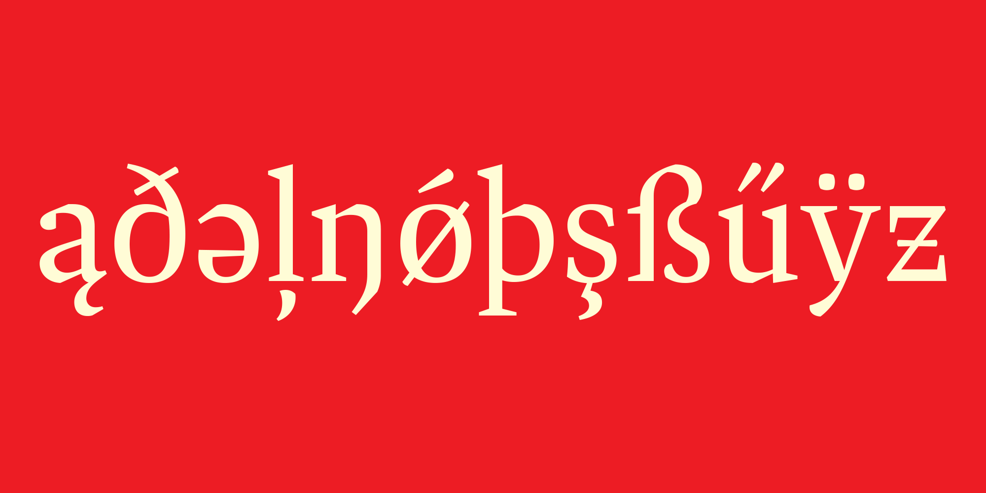
A classic and highly readable Antiqua, Spinoza was inspired by the rigor of mid-century German text faces like Trump Mediaval and the lucidity of Janson revivals like Monotype Ehrhardt. Its proportions are compact and its contrast relatively low. Robust thin strokes and pronounced serifs and terminals make it suitable for setting in small sizes under challenging conditions, both in print and onscreen. Abruptly tapered junctures keep characters sharply defined and, in the heavier weights, create enlivening light traps. Its curves are subtly faceted, with extra corners and unexpectedly straight edges that add interest in display sizes and energy in text sizes. Caps are relatively light and do not interrupt the flow of the line. The italic is narrow and angular, with a 9.5° slope. It includes small caps, eight sets of figures, case-sensitive punctuation, and support for over 130 languages.
FF Spinoza has been awarded by the ISTD and _Communication Arts_, and selected as one of Typographica.org’s Favorite Typefaces of 2011.