Hennessy & Beloborodov
2012
Designed by David Dowling and Ryan Kavanagh at RichardsDee
Categories: Identity
Industry: Commercial
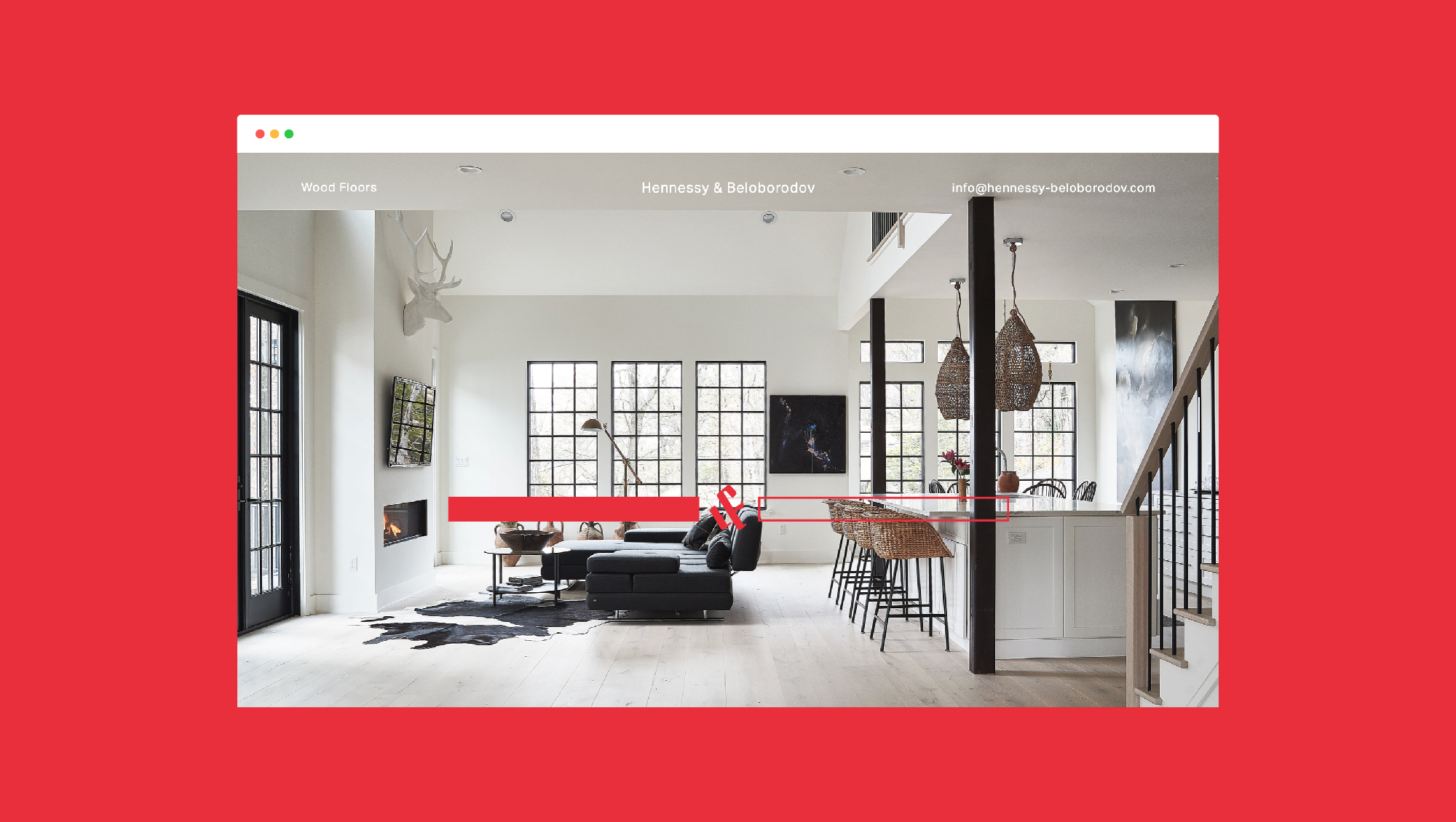
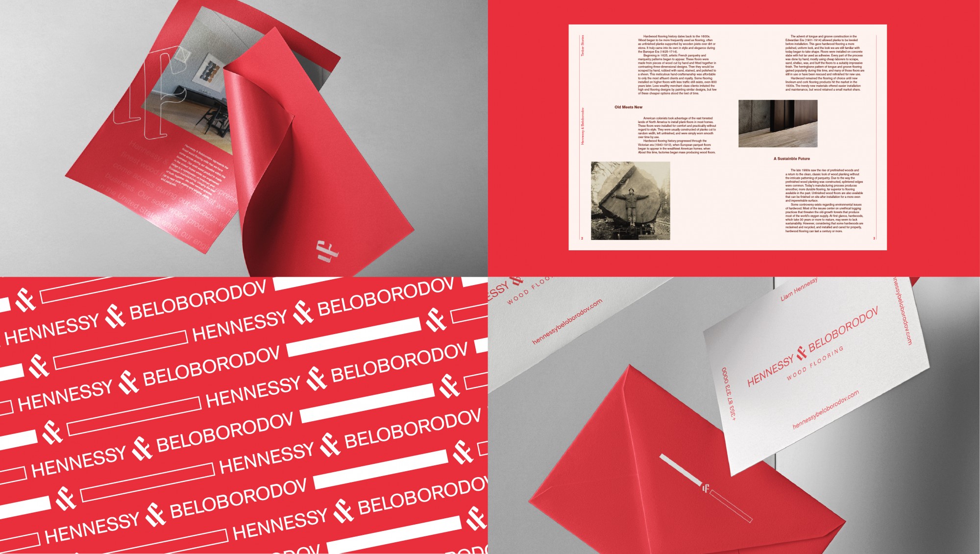
Hennessy & Beloborodov represents the finest wood flooring mills that they have discovered during decades within the business. We helped them craft an identity that told the Hennessy & Beloborodov story. Two people. Two personalities. One mission. That mission is to challenge the traditional way of doing things, through adaptability and flexibility, which occur naturally in both their products, and their people.
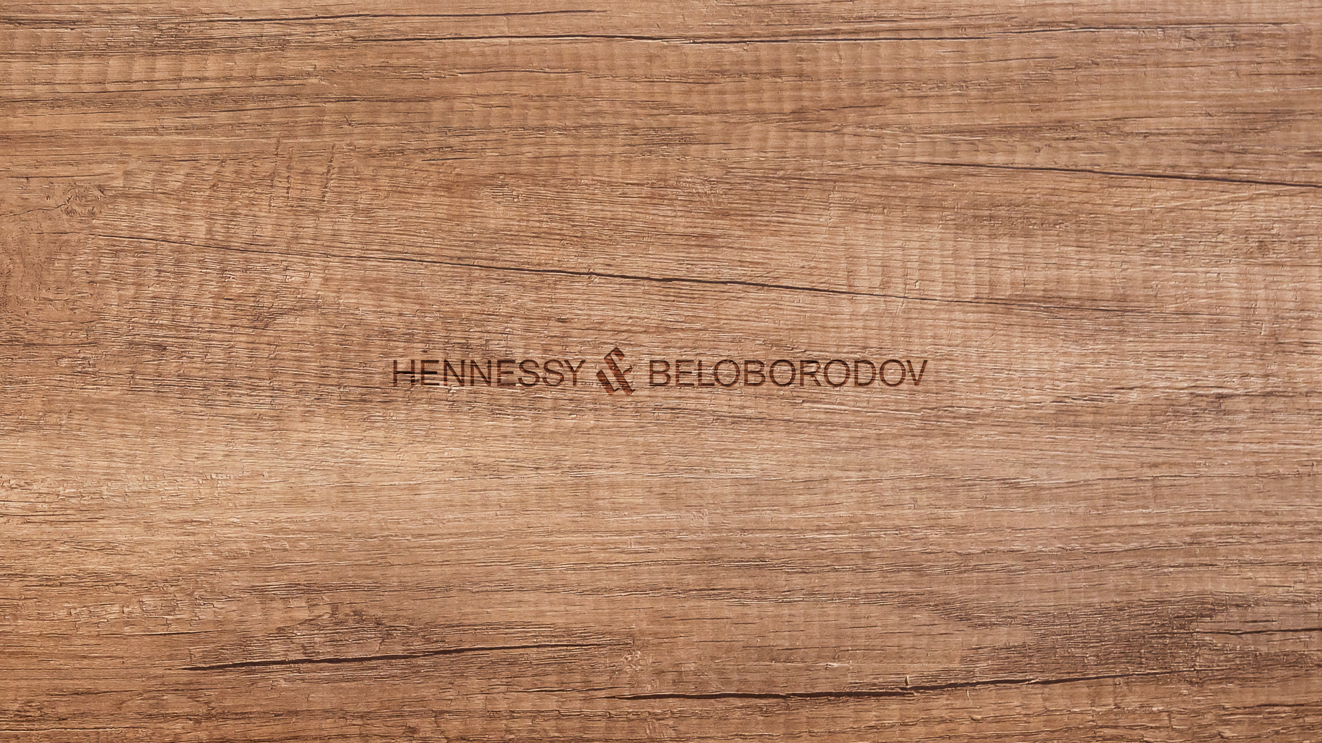
The identity uses two contrasting shapes, representing the natural qualities of their products. It also acts as a visual device to represent both Liam Hennessy and Fyodor Beloborodov. To join these forces, we developed an ampersand which is formed from the letter L and and the letter F.
The bold red and white colour palette stays true to their mission of challenging the traditional way of doing things in the industry.