Horizon8 – Brand Name and Identity
2012
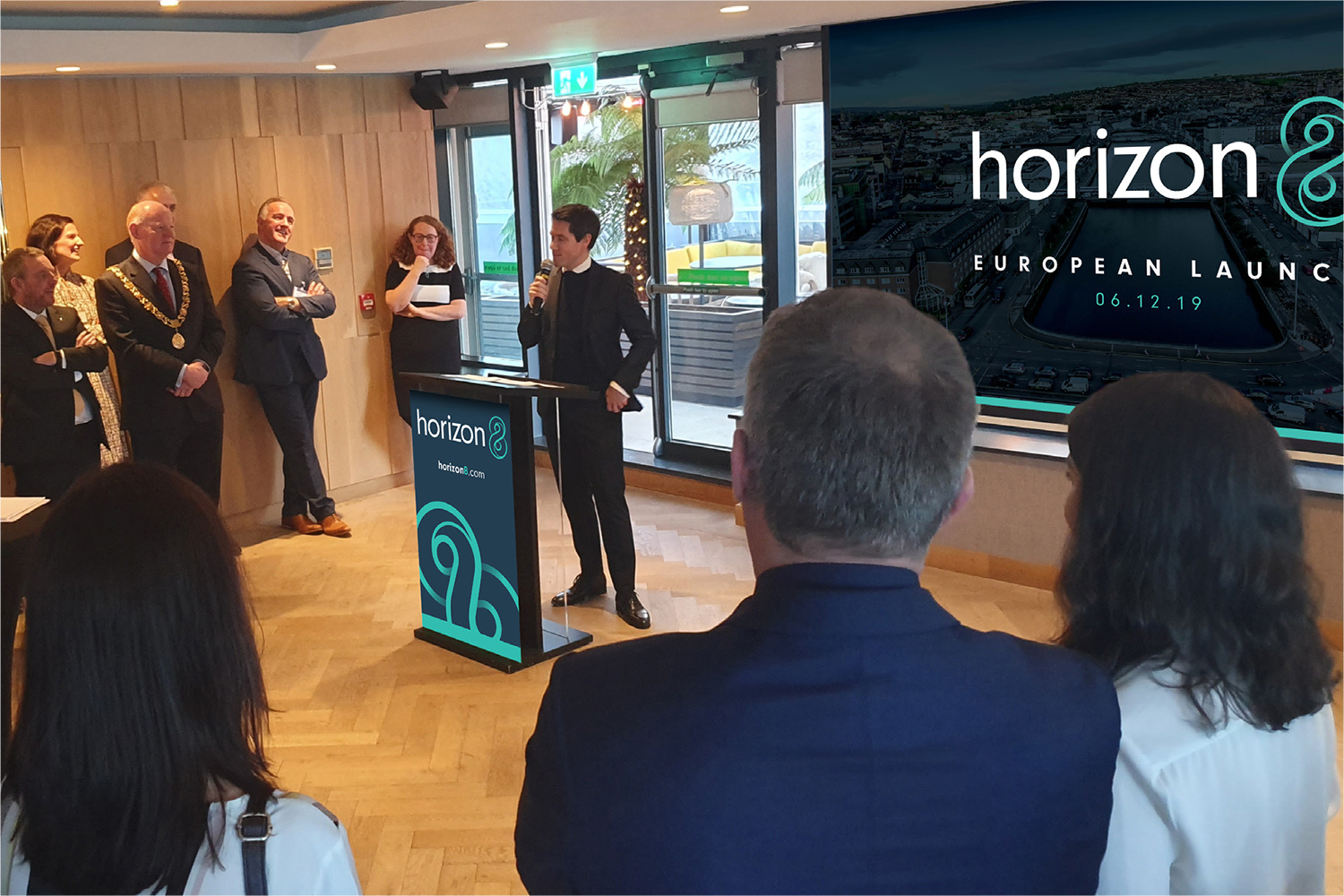
HengTian is an innovative technology company, which was founded in 2004 as a partnership between Boston based State Street, Hangzhou based Insigma Technology and Zhejiang University. They were expanding into Europe and the US and appointed TOTEM to develop a new name and identity.
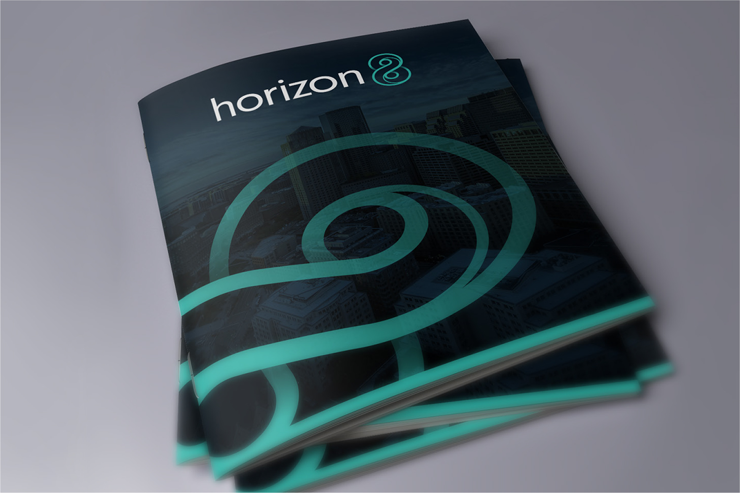
The name needed to be easy to pronounce and communicate the infinite possibilities their innovative technology solutions provides. But they were also immensely proud of their Chinese roots and it was that history and proven track record, that would form the cornerstone to building trust and credibility in these new markets. And so, the name Horizon8 emerged – inspired by the current name which directly translates as infinite horizons, with the figure 8 as a symbol of that infinity.
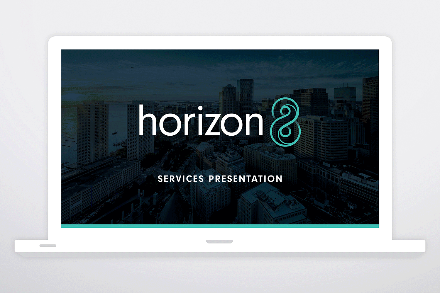
For the identity we created a figure 8 motif that loops infinitely around on itself, with an elegant inner line that gives this symbol added movement and depth. The motif was paired with a contemporary lowercase sans serif font creating a confident brand identity. A complimentary colour palette of teal green and navy was use to reflect Horizon8’s personality as a trusted and innovative partner, while also differentiating it from competitor colour schemes.