IKINDI Rebrand
Designed by Naoise Ó Conchubhair at CI Studio
Creative Director: Mel O'Rourke
Designer: Conor Flood
Photography: Seán Jackson
Portfolio Photography: Bridget Butler
Portfolio Photography: Al Higgins
Industry: Corporate
Tags: Digital
Website: ikindi.com
IKINDI are a New York based software company providing powerful data management and integration tools across the middle office of large financial institutions. As experts in their own area it became evident to us that IKINDI were attempting to communicate with their target audience in language and terms that were too complex.
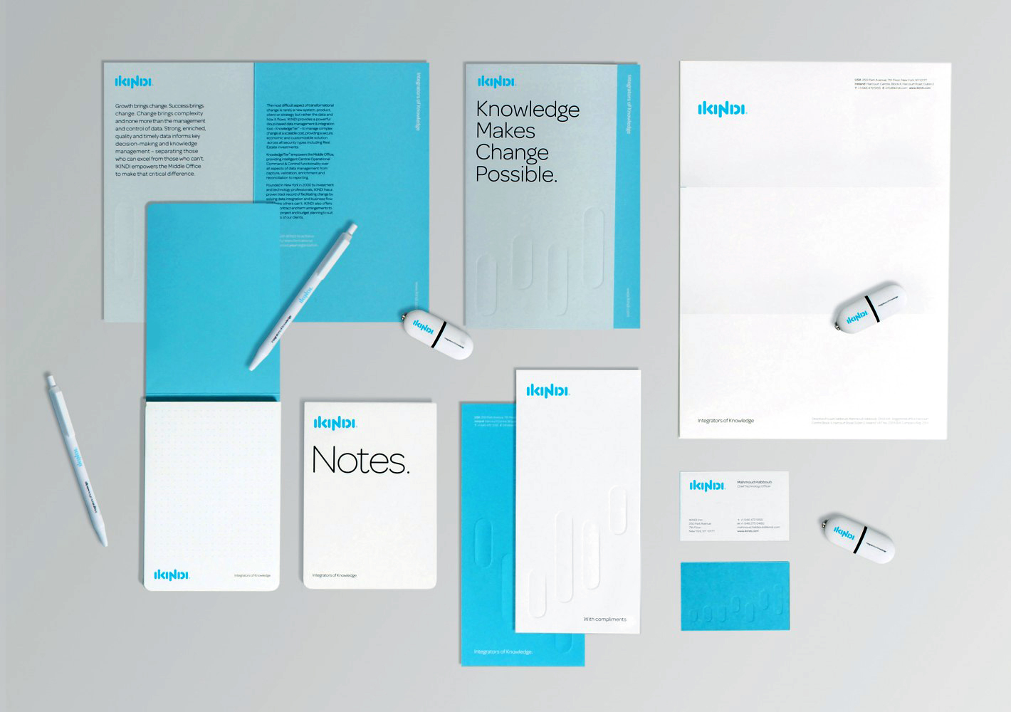
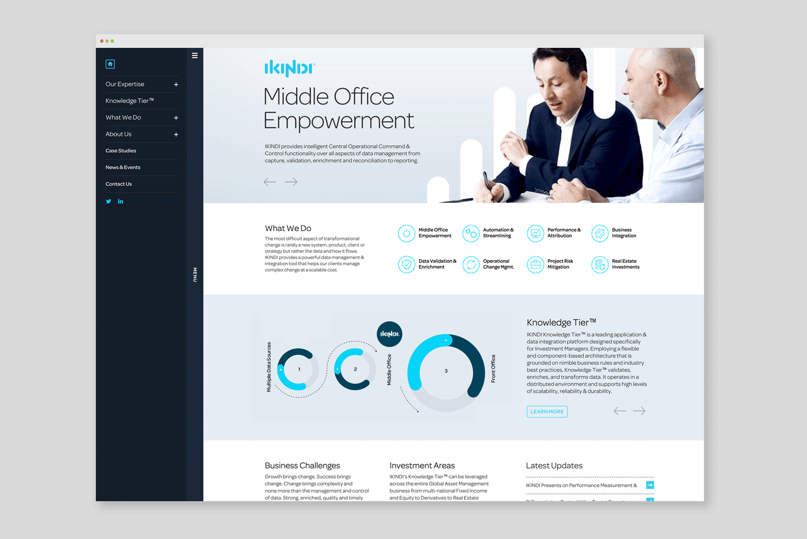
A customised distinctive typographic mark based on letterforms drawn from a rounded line shape forms the basis of the identity. These shapes can be interpreted as 'nodes of data'. In animated form the logo starts as a jumbled mixture of shapes that then merge together to form the IKINDI logotype. This simple visual metaphor effectively translates how they interpret data and make it pure. The robust logotype along with the tagline we created: "IKINDI Integrators of knowledge” was then easy to apply across a wide range of collateral from print to digital. These exploded data shapes integrate with photography for visual interest and provide the basis for diagrams and infographics, all helping to create a unified and consistent brand.
On the web, icons and infographics allowed us to communicate far more visually with written word count reduced by more than 50%. We were delighted to learn that IKINDI have recorded a 40% increase in sales in the months since completing the rebrand.