Klar
2011
Designed by Evan McGuinness at Bielke+Yang
Designer: Christian Bielke
Designer: Martin Yang
Photography: Maja Hattvang
Categories: Packaging
Industry: Commercial
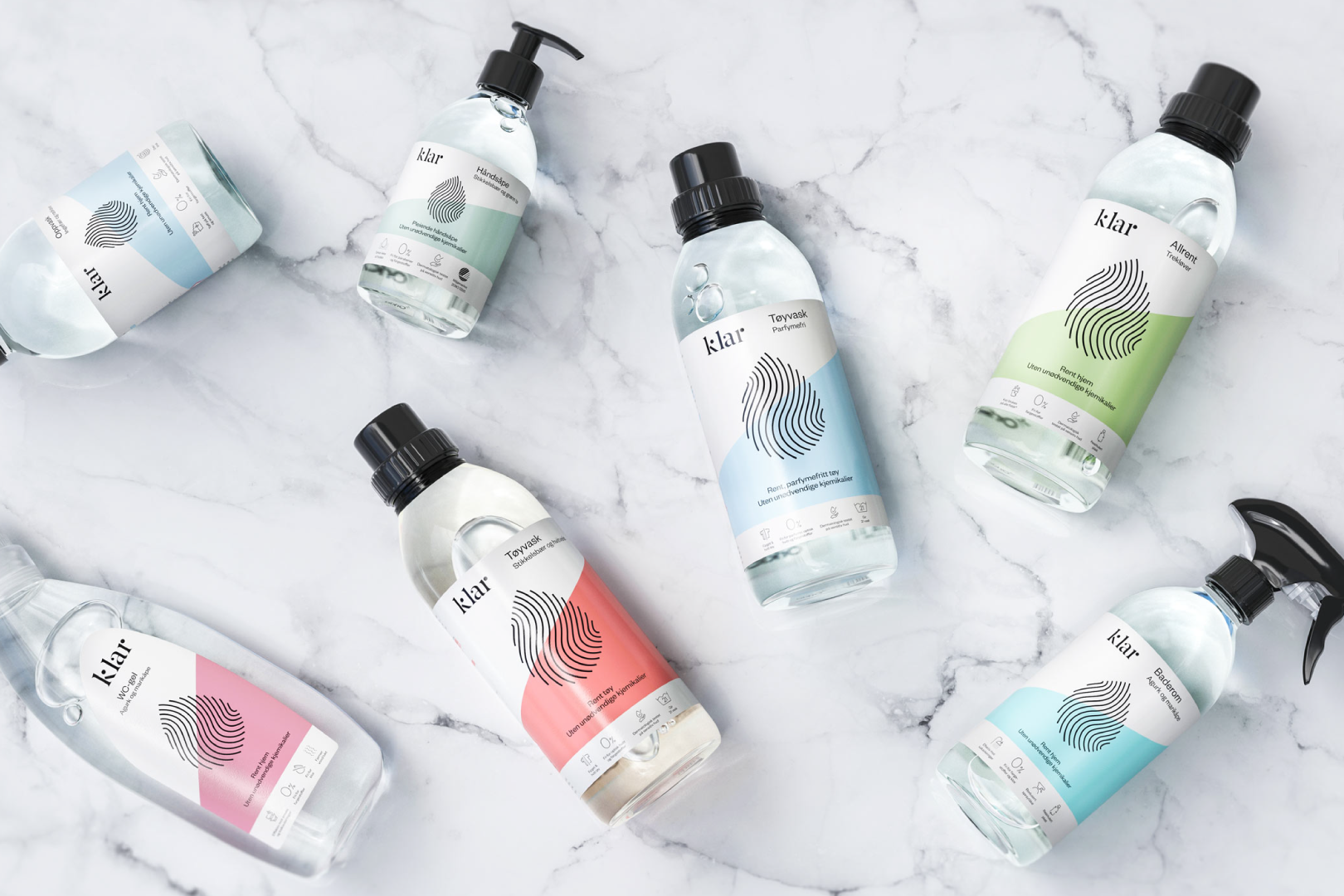
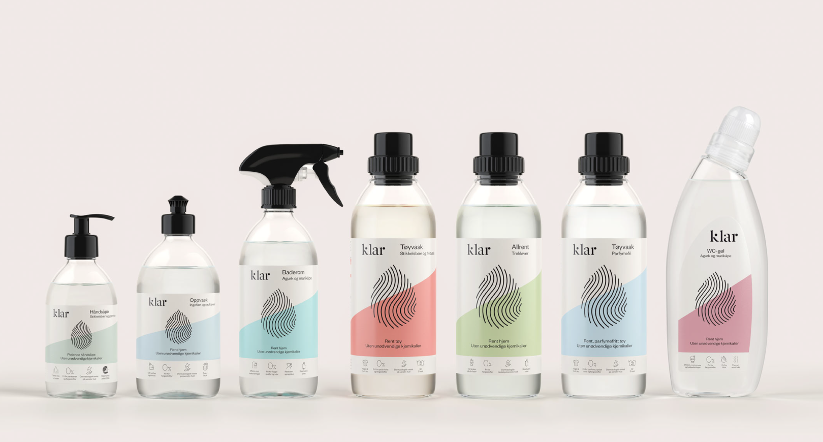
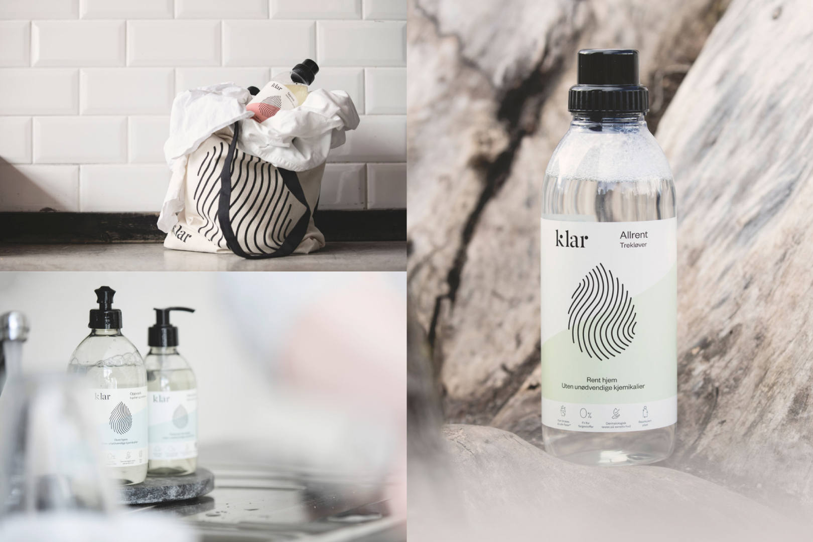
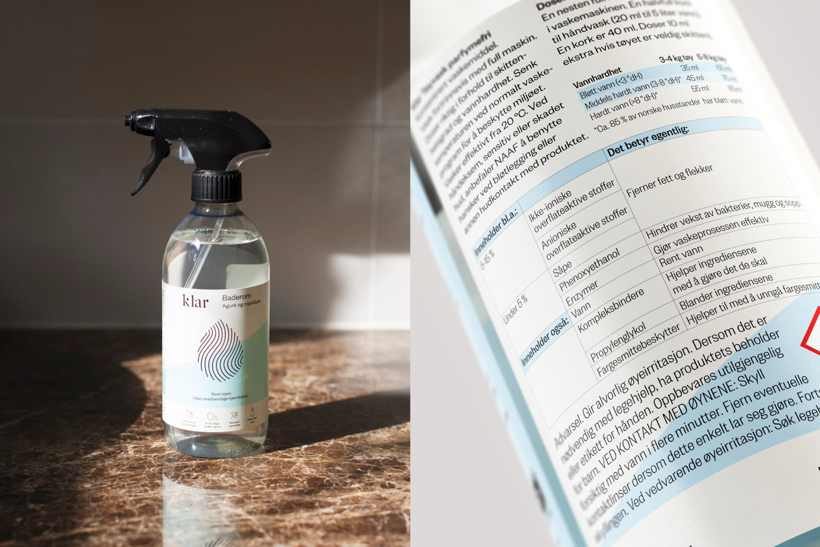
We developed the brand identity for Klar, an environmentally-conscious line of household cleaning products. The process also included naming and packaging design. Klar is more than your regular cleaning agent—it’s good for the environment, effective and designed to be kept on display. The recycled plastic bottles are produced in Denmark using windmill power only.
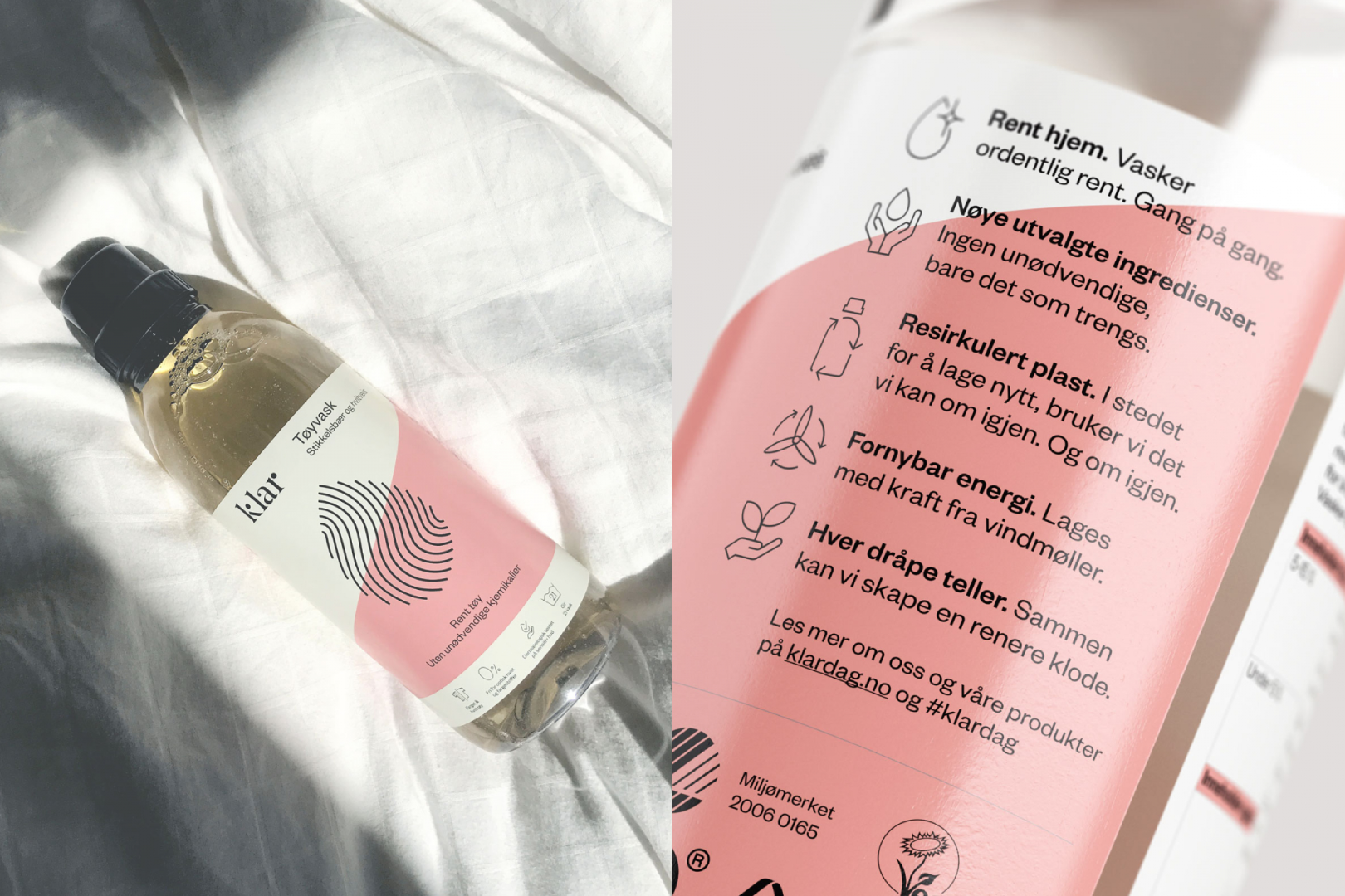
‘Klar’ (Norwegian for clear) has a number of meanings; open, understandable, uncontaminated, see-through. By being 100% transparent, and simplifying the language and graphic elements, it becomes apparent what the product contains and why each ingredient has been included. This is shown through the use of symbols and an intuitive and explanatory list of ingredients on the back label. Larger symbols on the front are used to give the consumer a quick impression of product benefits and content.
The clean look and natural, soft colour palette conveys the essence of the brand, highlighting the environmentally friendly traits of the concept without being too obvious. The combination of quiet and confident makes them stand out in a rather noisy store environment. Klar is sold in most Norwegian supermarkets, and will soon be available across Europe and Asia. The product range is built to expand, as the design easily can be adapted to other languages or new additions in the product line.