Quillsen Identity
Designed by Rachel Kerr and Philip Mitton at CI Studio
Creative Director: Mel O’Rourke
Photography: Bridget Butler
Categories: Identity / Print / Signage / Environmental
Industry: Corporate
Gunne Residential was required to change it’s name due to a management buy-out and the new management approached us to handle the rebrand including the new name. They wanted something fresh and distinctive which would set it apart from the more established competitors of DNG, Sherry Fitzgerald and Lisney. The challenge was to design an identity system including the logo which would be easy to manage themselves, would have impact when seen in it’s specific environment and have an attention to detail lacking in the other players brand collateral.
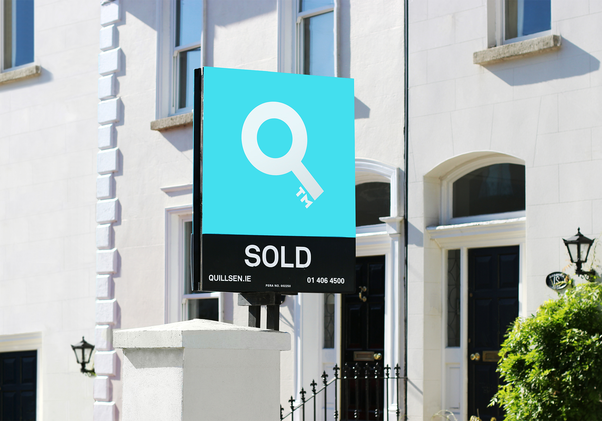
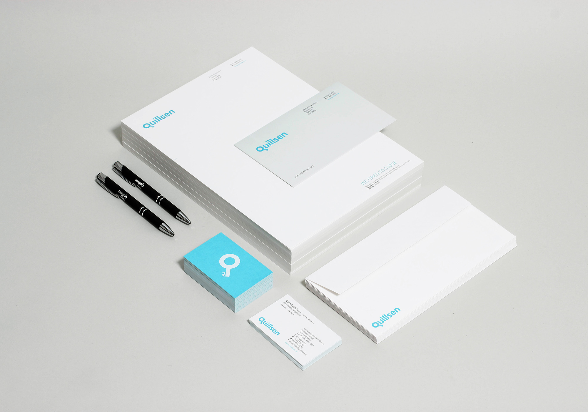
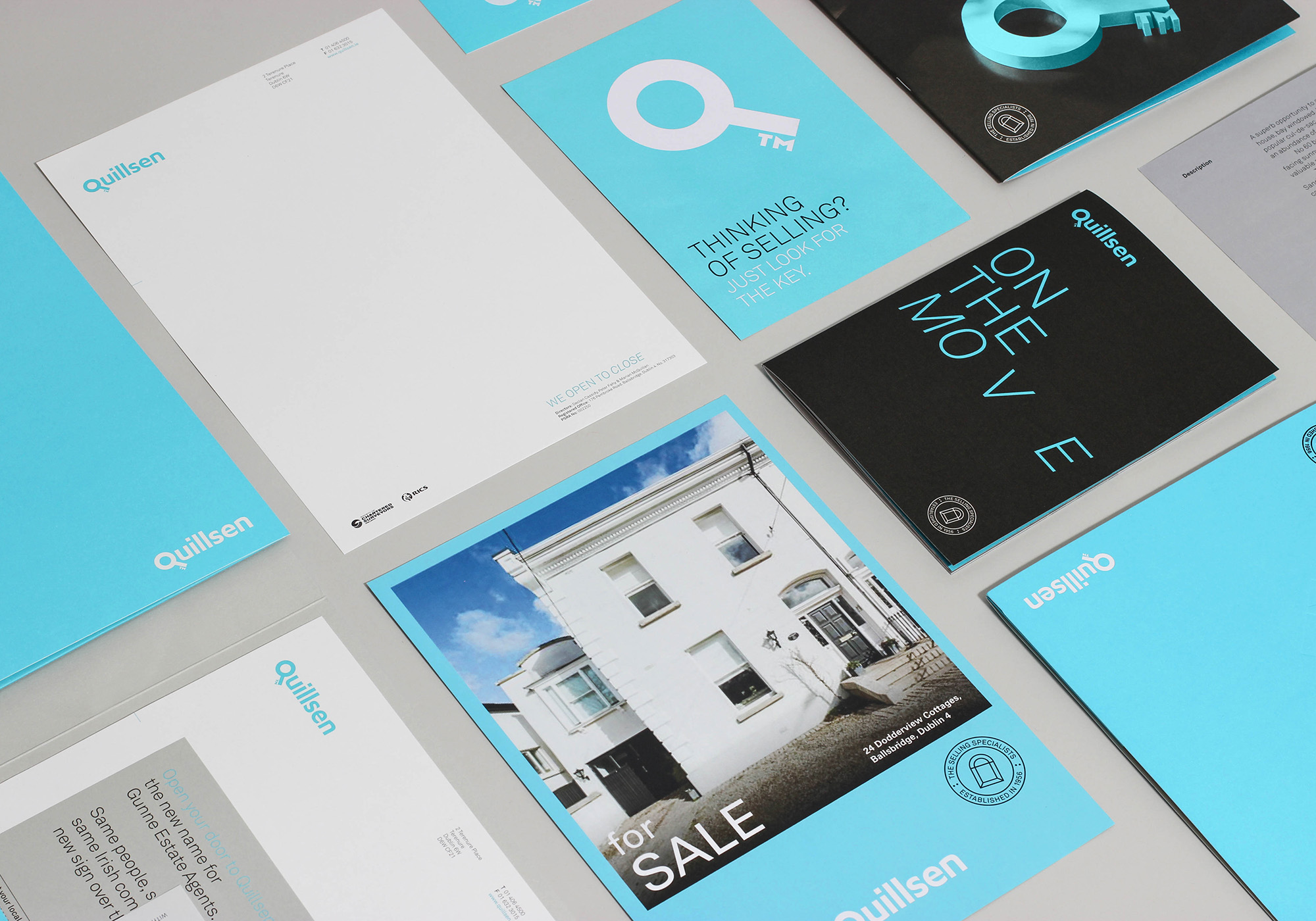
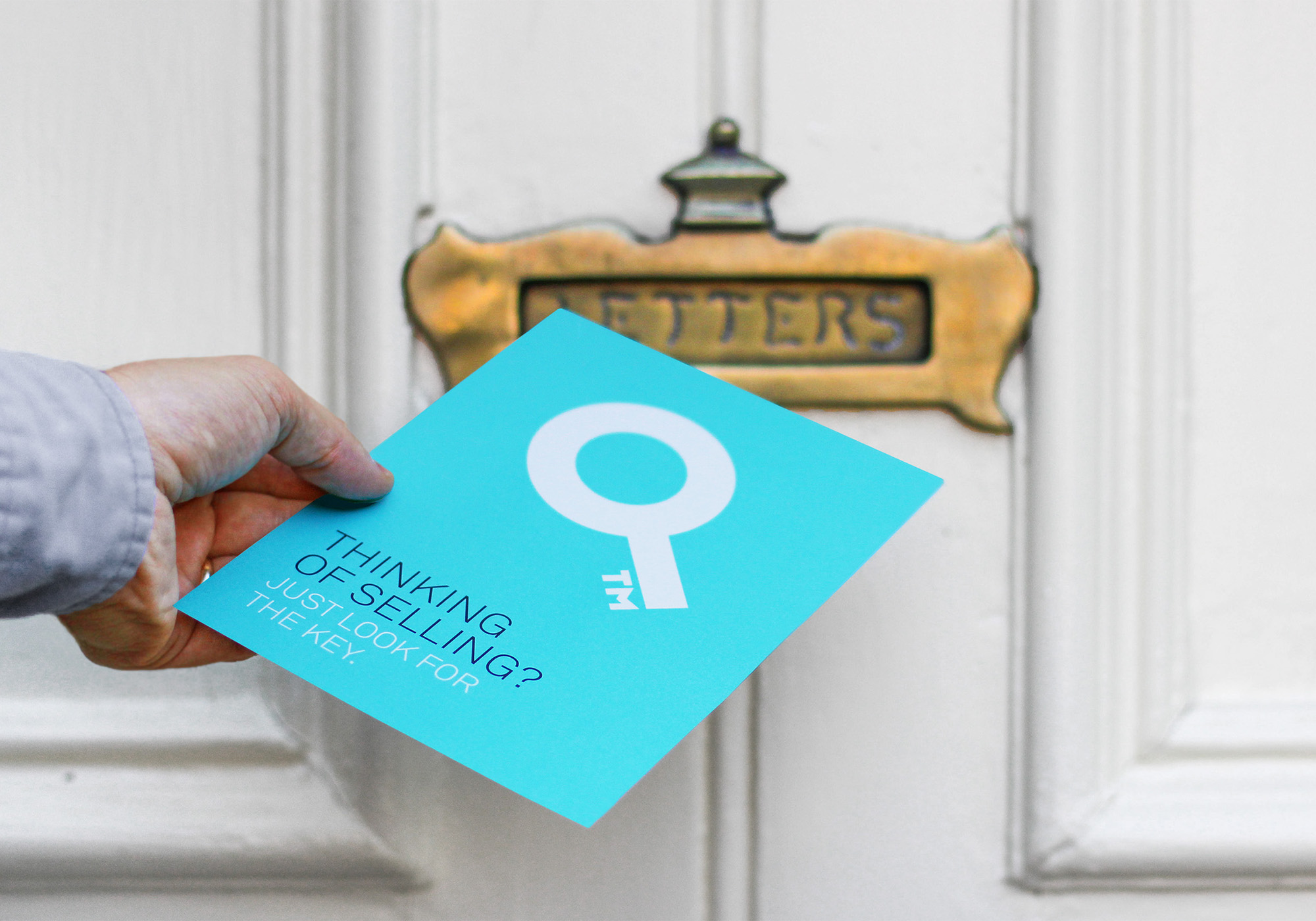
We generated the Quillsen brand name, an amalgamation of the directors’ names, giving it a sense of place without being a typical family name common to every other competitor in this sector. We chose the typeface Karbon for it’s simplicity and strength, crafted and tweaked it for overall balance and symmetry. Due to the nature of it’s application, particularly digital, the Q had to become an important stand alone symbol. To give it distinction in a busy marketplace as well as help define the sector it’s in, we looked to give a key like appearance to the Q without it being overtly contrived. Integrating the typical TM symbol into the Q helped solve the dilemma and gave us a key without the need for any extra embellishments.
From the logotype, we designed the brand identity system using a simple palette of three colours and white – a bright pop of turquoise complemented by a light cool grey and black. Both the Q symbol and the Quillsen logo are used intermittently along with the colour palette and the copyline We Open To Close which alludes to their expertise in closing the deal. We applied this simple system to all marketing material from boards and signage to interiors and livery.