Spike Island Rum
2013
Designed by Clara FitzGerald and Seán O'Beacháin at So&So
Illustration: Steve Doogan
Photography: Brendan Ryan
Categories: Packaging
Industry: Commercial
Website: soandso.ie/#/spike-island/
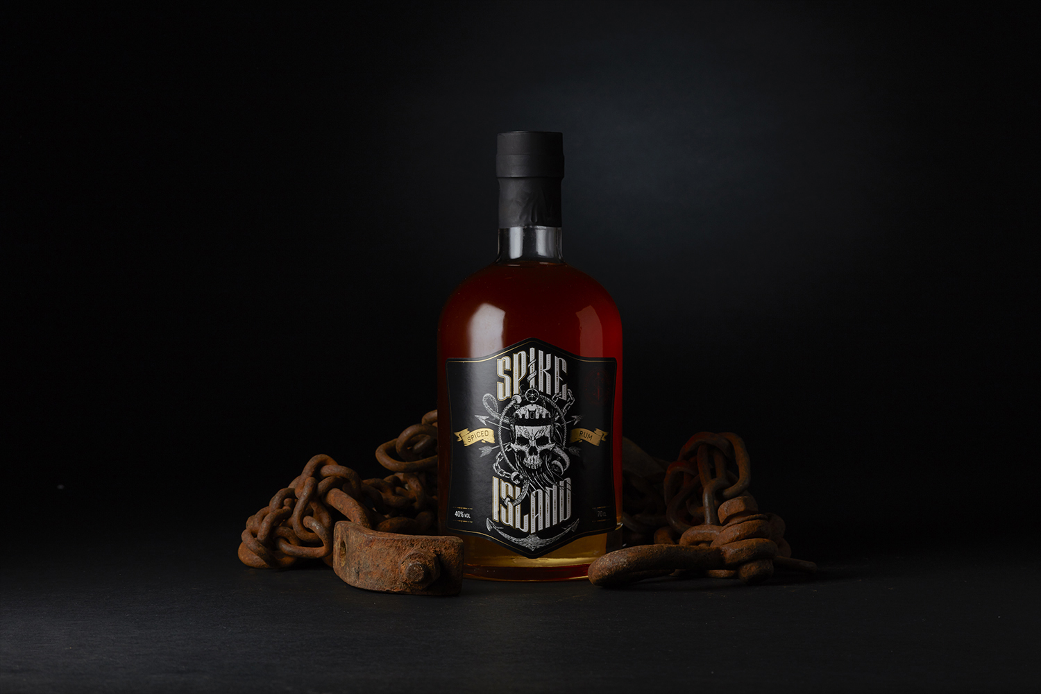
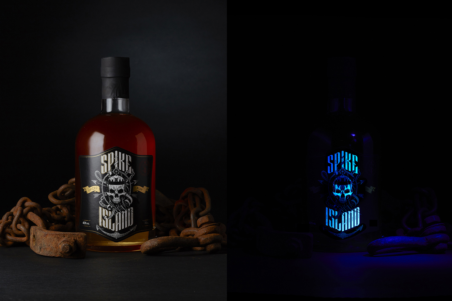
The team at Anchor Spirits approached us to refresh their Spike Island spiced rum brand and packaging. We were asked to create a brand which felt both raw and edgy but also premium and sophisticated. They wanted the rum to appeal to bikers and rockers but wanted it to feel just as at home in a highball as it would in a shot glass.
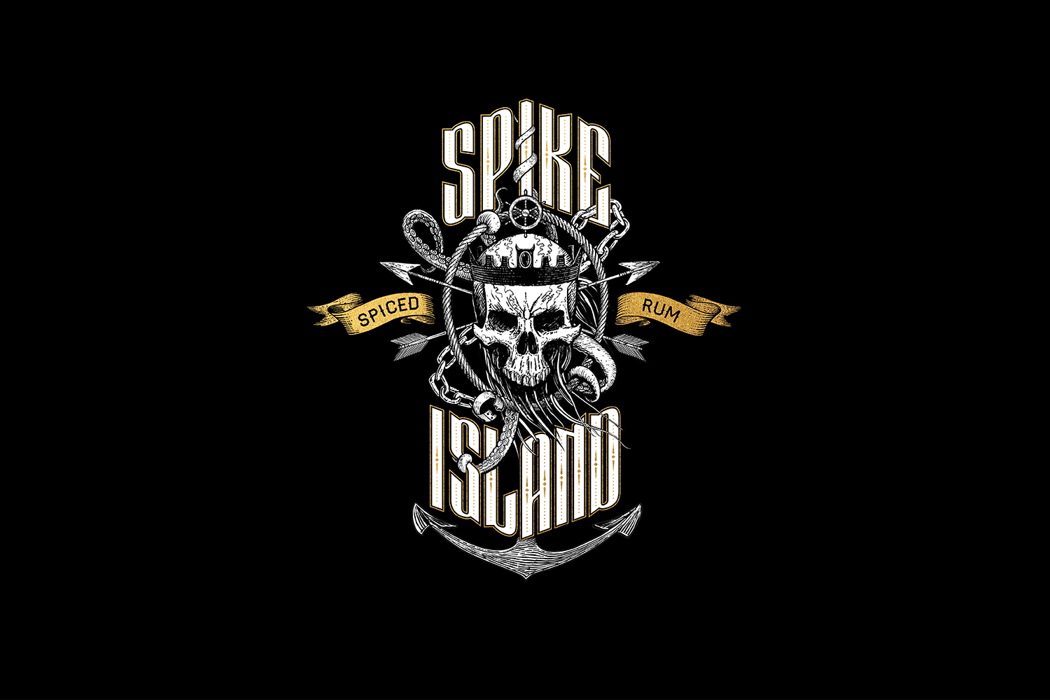
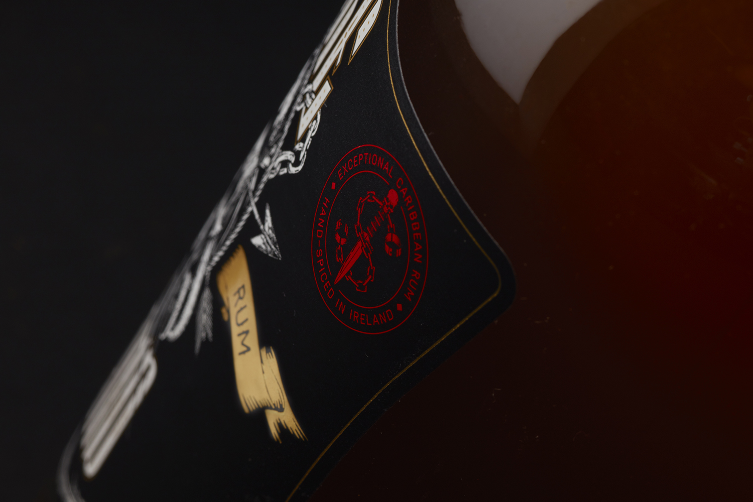
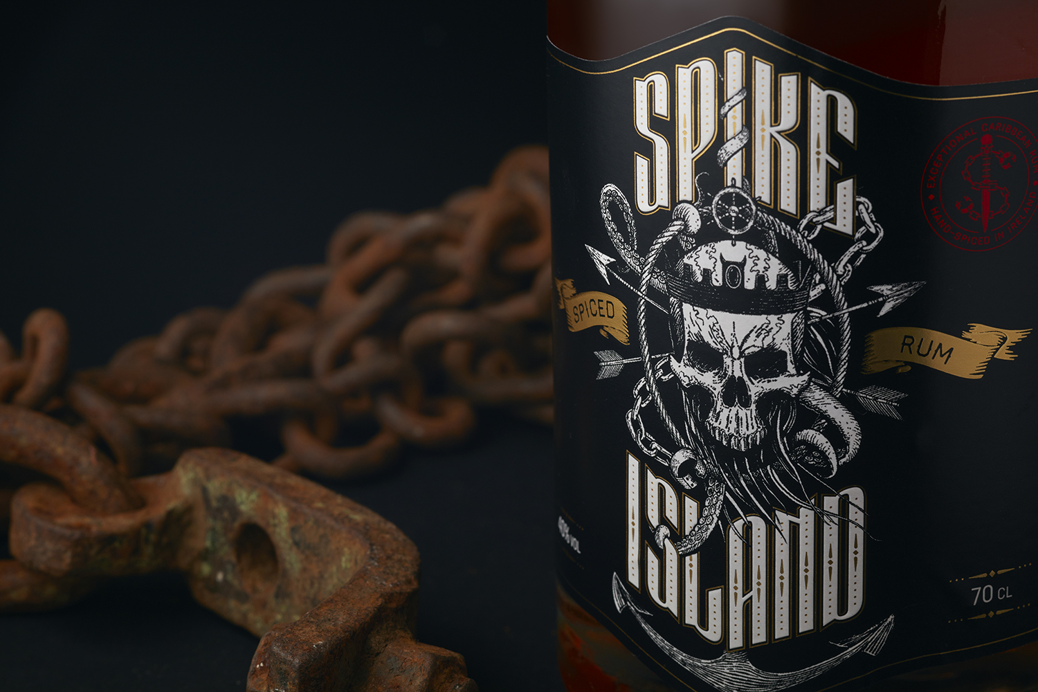
Taking visual cues from rock album artwork, tattoo art and biker culture, we teamed it with historic references from Spike Island in Cork, Ireland, from which the rum takes its name. The label shape is a reference to the 18th century star-shaped fortress on the island, while the skull, anchor and chains hint at the island’s maritime history. We then used these cues to create a monogram of the Spike Island initials. A black and white palette with gold foil details and fluorescent red highlights was used to build on the edgy but sophisticated character, while the language plays into the maritime folklore of “sinners, scoundrels, beggars and thieves”.
As a final touch, we added a secret homage to Alice Cooper which only becomes visible under a blacklight.