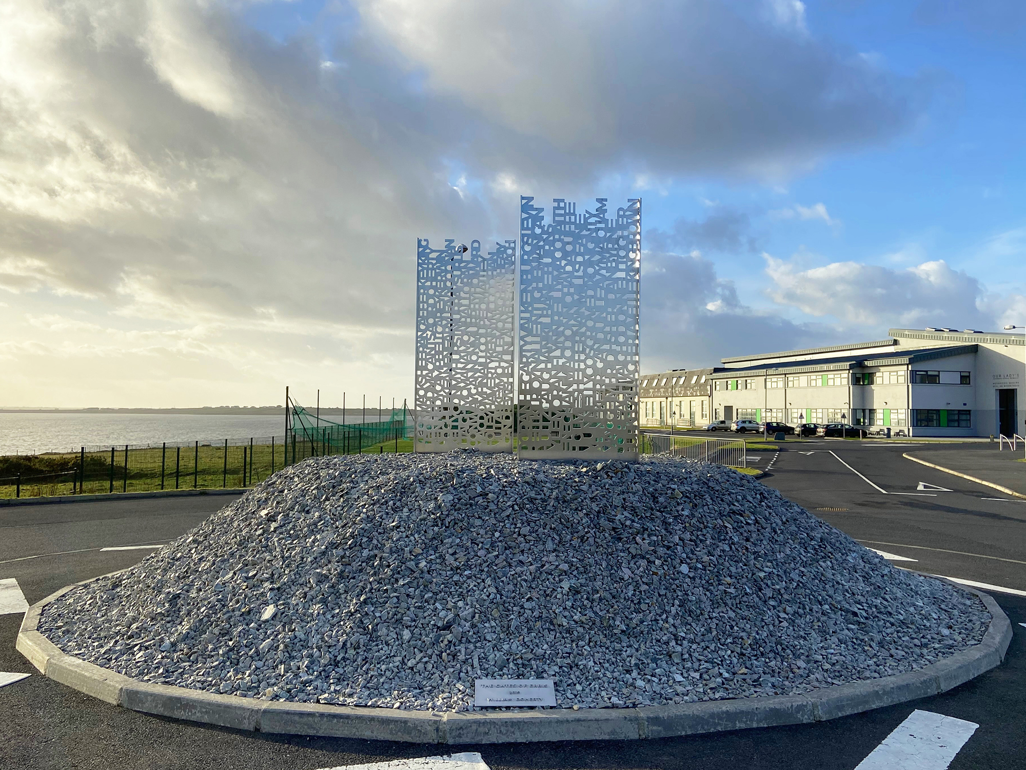
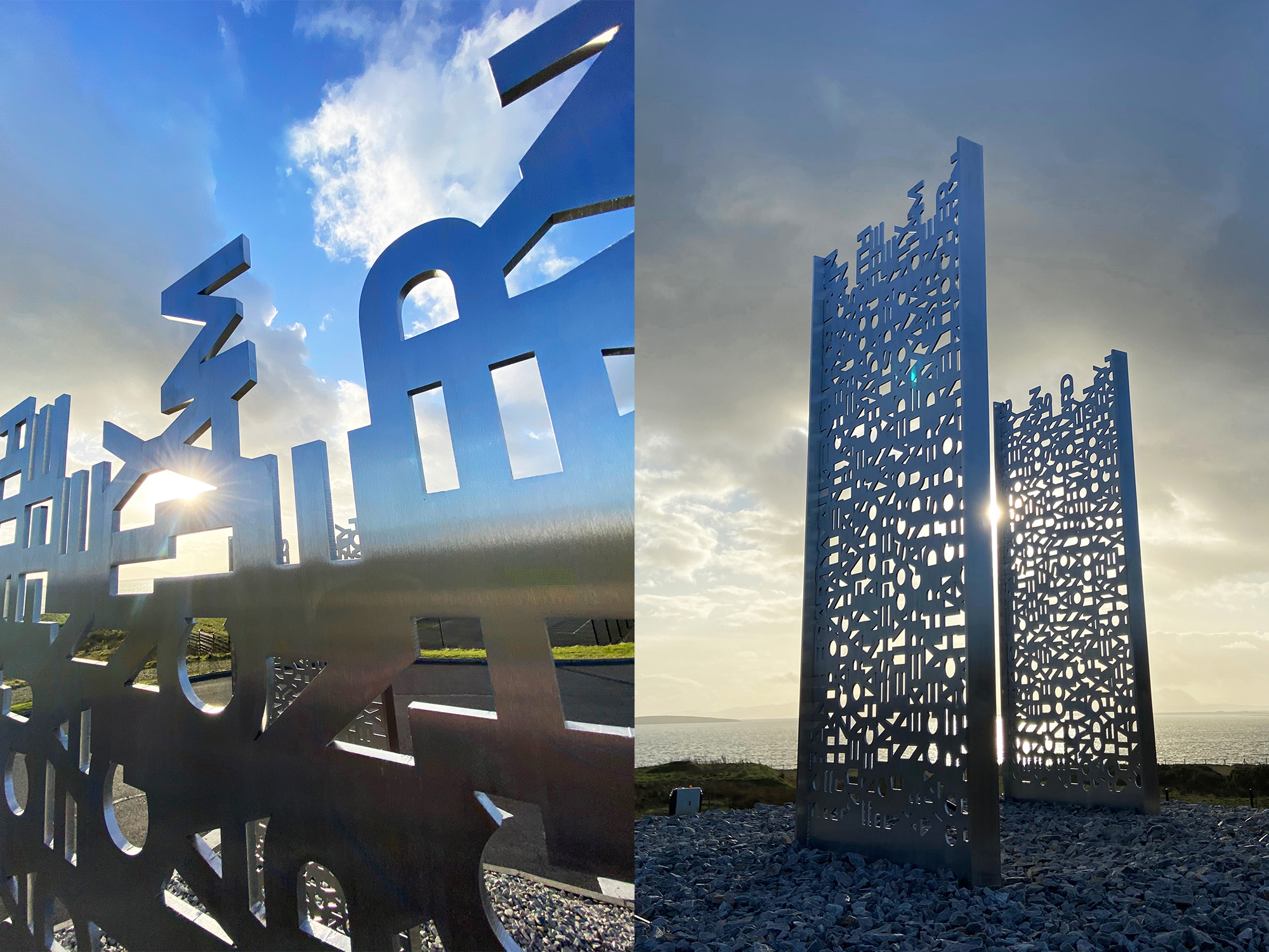
The Gates of Erris
2012
This typographic laser cut stainless steel Public Art sculpture was commissioned by the Department of Education for Our Lady’s Secondary School in Belmullet.
The piece symbolises an underlying theme in Our Lady’s Secondary School’s history in Erris, the fostering of true unity through a sculpture inspired by the rich cultural heritage of the catchment area of the School. The rural region of Erris, located along the Atlantic Coast in the west of Ireland, is engulfed in history and folklore which has always been an important part of the cultural fabric of Erris and its people. The Gates of Erris is one such story that is as symbolic to Our Lady’s Secondary School today as it was to people living in Erris centuries ago.
The forgotten and once iconic Gates of Erris was located in a mountain valley in the centre of Erris called Glencastle. Standing in the middle of this glen and guarding a gateway in Erris stands an ancient fort called “Dun Domnall” or the fort of Domnall. It was here at this ancient fort that The Gates of Erris once stood. According to Celtic folklore & legends every night The Gates of Erris were closed against all intruders and a toll had to be paid for each traveller who passed through or the traveller may never be seen again.
Enthralled by this piece of local folklore and the idea of a stream of these ancient people, the ancestors of today’s students, passing through these gates over the ages, I couldn’t help but see the similarity to Our Lady’s Secondary School as the conceptual form of this gate in Erris today.
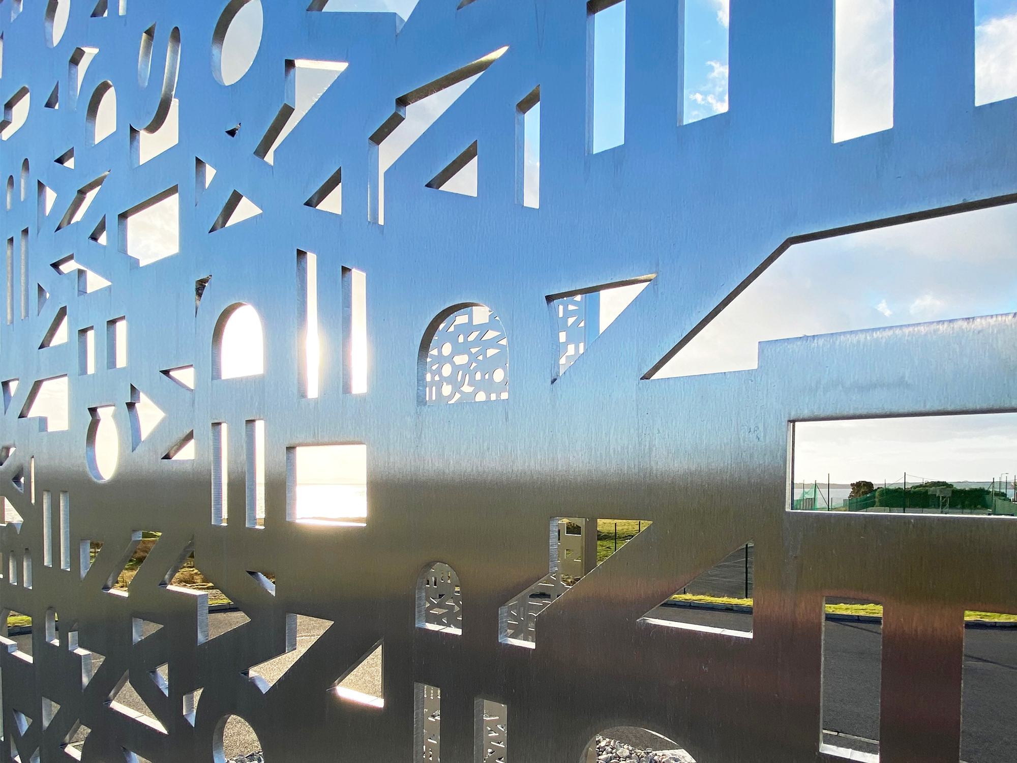
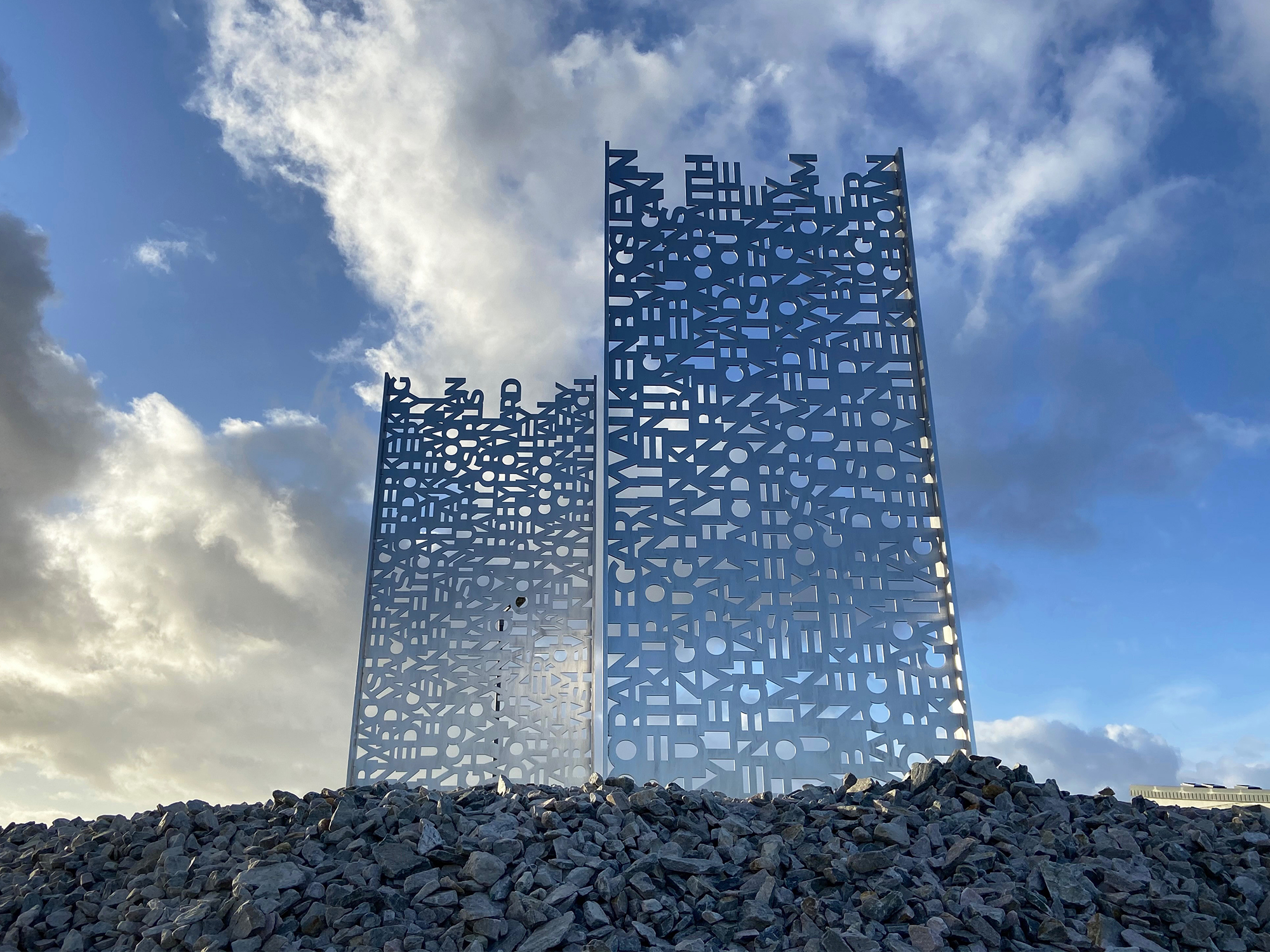
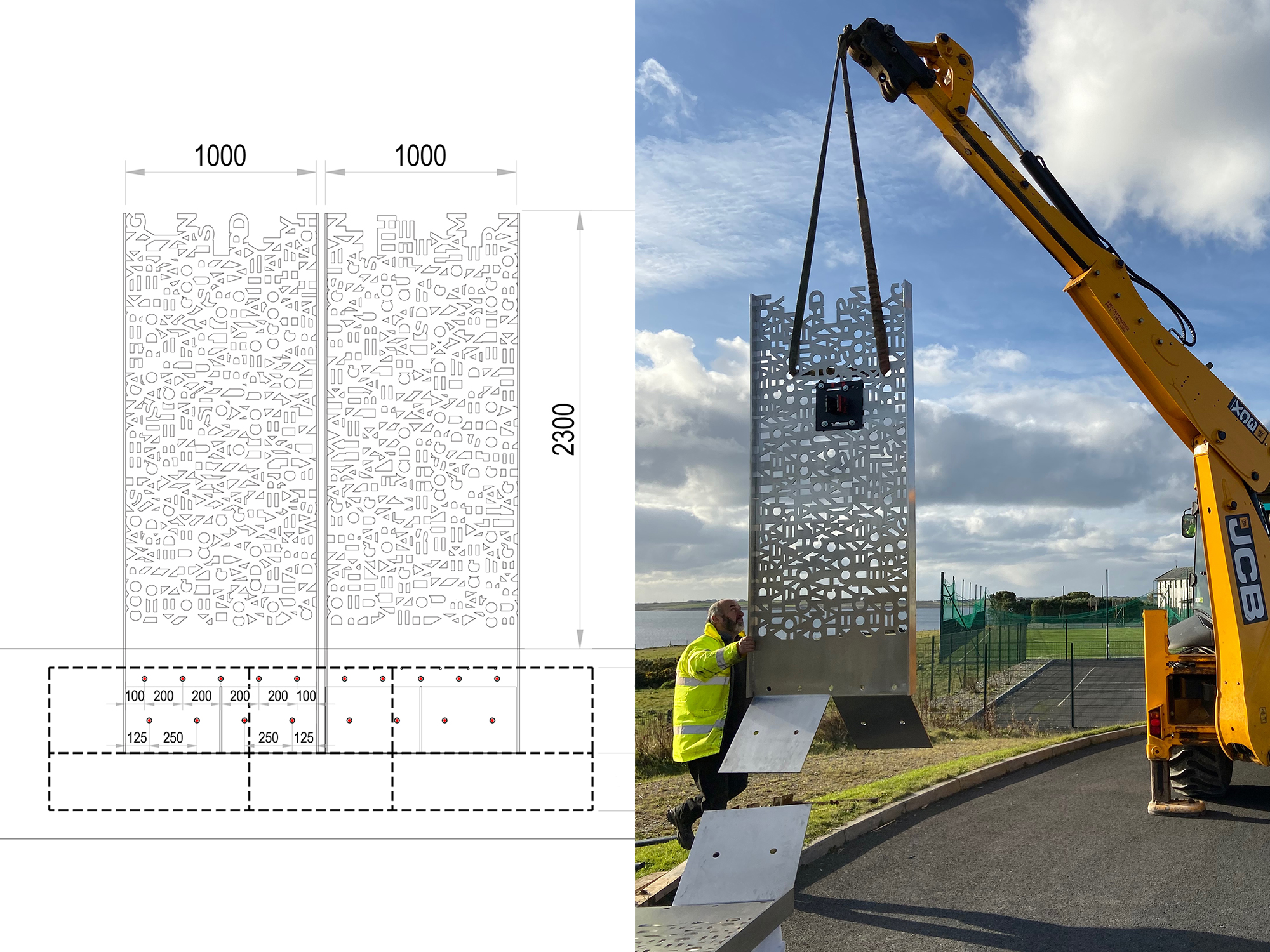
The sculpture takes the form of a contemporary conceptual gate. The gate is constructed from letter forms that spell out family names that make up the multifaceted identity of the students at Our Lady’s Secondary School together with the names of the Sisters of Mercy who founded the school and the families now living in Erris.
The use of combined typographic elements as the main visual aesthetic provides physicality through words that convey the essence of a place, a people and the connection between them. Allowing a more integrated reading of the landscape the students and staff of Our Lady’s Secondary School inhabit. The design emphasises form and language, making it universal expressing the idea of when there is teamwork and collaboration, wonderful things can be achieved. The use of typography creates a conceptual duality between the negative and positive space of the letter-forms and the surrounding landscape of the sea, sky and the school. By using the family names the work creates a gamut of emotions while also paying tribute to the families that make up the schools shared history with the community, creating a sense of belonging while integrating and honouring the personal and communal. The work has no negative assertions, but rather a message of hope, community, beauty and strength in unity.